Social networks are a simple, efficient channel for letting readers know about your digital publications. But not all shares are equally effective. For example, garbled text and broken links will attract fewer clicks than well-prepared content. To optimize your publications for best results in social media posts, you can take a few easy steps in just five minutes.
In this article, we’ll be highlighting quick fixes that give your publications a professional look for sharing on Facebook, Twitter and more.
Add a clear title
When you share a link to your Calaméo publication on social media, its title has a big place in the post. In fact, the title usually appears in a bigger and/or bold font. As a result, you should be sure to choose a clear, concise title for your publication. Even better, include keywords to interest your audience. Avoid including information like the file size and type that may distract or confuse readers.
Get descriptive
A short description is a great opportunity to introduce your publication to potential readers scrolling through their social media feeds. Since the description text appears in the link preview, make it count. We recommend that you give an overview of your publication’s contents, in addition to a strong CTA. And of course, always review your social media post to double-check the formatting—making changes to the description on Calaméo is painless.
Showcase bold covers
Your publication’s cover image will be shown in the link preview on social media, so it should stand out! First, make sure your publication has a dedicated cover page. Next, consider the design. To catch the eye of curious readers, you may prefer a bold, colorful cover instead of a white background and small type. Check out the example below:
Check privacy settings
In order to share your publications on social media, you first need to verify that they are accessible to the right audience. You can share a private publication that has been authorized for access with a private URL. Or you may also configure a private publication for subscriber access. Your subscribers will then be directed to log in with the unique username and password that you have defined for each of them.
Select link options
Once all of your publication’s properties are prepared, it’s time to choose the link that you want to share on social media. You can either link to the overview page of your publication on Calaméo or directly to the viewer. Want to highlight a particular section in your post? Just add ?page= followed by a page number to the publication URL. Your link will bring readers straight to that page.
💡TIP: If you’re sharing a publication on Facebook, try using the Sharing Debugger to confirm that the title, description and cover display properly before you hit post.
Include hashtags
Tags and hashtags are a smart tool to help more people discover your publications on social media. A little research will tell you which hashtags related to your business or activity are most popular. But don’t be afraid of less-used, quirkier hashtags either—they can add personality to your posts. Tagging other accounts or pages should only be used when relevant, such as tagging a business featured in an article of your publication.
With these quick and easy tips you should be ready to optimize your digital publications for social media posts. And if you want even more ideas to develop your sharing strategy, head on over to our Digital Publisher’s Guide to Social Media.
We love to see the amazing content our users publish on Calaméo! Tag us @calameo on Facebook, Twitter and LinkedIn. Or show off your best covers with the #CalameoCoversClub hashtag for a chance to be featured on our homepage.
At Calameo, we know content marketing well. Indeed, we work with it every day, because we help you host and share all your content. We also create a lot of content ourselves and of all kinds, like our Calameo Magazine, for example. And it is thanks to this, that we can present you today the 5 mistakes to avoid in your content marketing strategies.
These 5 mistakes are very common, and can, unfortunately, be a real brake on the effectiveness of your content. It is therefore important to avoid them.
1st mistake: you don’t have a clear strategy
The first mistake many make when starting out with content marketing is not having a strategy.
Indeed, a solid strategy is the foundation of all content creation. If you haven’t thought through and tailored your strategy to your brand and goals, you’ll burn out creating content for nothing.
Without defined goals, without a guideline, you will get nowhere, because it is impossible to achieve undefined goals. And that’s a shame, because content marketing can be a very powerful tool when you know how to use it to your advantage.
So you’ll need to work well on both your digital and marketing strategies, and then make sure your content marketing strategy respects and amplifies them as much as possible. In reality, content creation is part of the strategic marketing realm, and it’s important that all of your strategies are aligned and working towards the same goal and direction.
Some elements to define in your content marketing strategy:
Your objectives: improve your brand image, boost your traffic, increase your visibility, etc.
Your targets: who do you want to reach with your content?
Your budget: how much money do you want to invest?
Your metrics (KPIs): You will have to decide on the metrics to follow to measure the success (or not) of your strategy and to be able to refine it at any time.
Your channels: social networks, website, magazine, e-mailing, blog, YouTube, etc.
Your types of content: articles, podcasts, videos, photos, MOOCs, livestreams, infographics, newsletter, etc.
Your editorial calendar: when do you publish? How often do you publish?
🔎 To sum up: only when all these elements are well defined and in line with your brand, can you create and distribute your content effectively.
While it’s a good idea to keep an eye on your competition, it’s not a good idea to copy their content. Your brand and theirs necessarily have differences, and that’s what you need to emphasize to consumers to convince them to buy from you, rather than others.
Get inspired, but don’t copy. If you spot a blog post offered by a competitor that is interesting and works well, take the basic idea and make it your own, branded version. Bring something extra to the topic, and make your content unique to stand out.
Copying your rival’s entire digital strategy is also to be avoided. If it works for them, it’s because it was designed to fit their brand and goals, not yours. Again, it’s essential to work your own strategy well, as discussed in the first point of this article.
The third big mistake not to make is not keeping a content calendar.
The content calendar is an important document in any content marketing strategy. With it, you can track everything that has gone live and everything that will go live in the future.
Without this guide, it’s very easy to get lost and spend weeks creating content to catch up, or have nothing to post for a long period of time.
Now, for your strategy to work, you need to be consistent and post at regular intervals. So it’s essential to keep your content calendar up to date. Think ahead of time about the type of content you’d like to offer your audience and adjust the creative chain accordingly. Everything should be set like clockwork: starting with deciding when what content should be created and published.
🔎 To get started: your content schedule should include such things as the publication date, publication channels, content type, general idea, associated text, and links to add.
4th mistake: you are not creating your content in advance
Combined with mistake number 3, this is surely the mistake that all content creators make when they start out: not creating their content in advance.
Indeed, if you haven’t created a content calendar and you don’t keep it updated, it will be very hard to create your content in advance. Yet, creating content ahead of time is crucial because you need to be able to publish continuously. This allows you to keep the attention of consumers and create a loyal audience for your brand.
Creating your content ahead of time is key to keeping you on track and always having something to publish. Also, since it’s a very time-consuming activity, it’s easier to create multiple pieces of content at once, setting aside specific times for content creation, and others for posting.
So again, strategy is crucial as it will allow you to set up workflows that are efficient and allow you to create the ideal amount for your brand and its ambitions.
🔎 To sum up: set up dedicated moments for content creation. The most comfortable is to always be 1 month ahead of time.
5th mistake: You are not using Calaméo (yet)
And here is one last mistake you can easily correct: not using Calaméo (yet).
This is indeed a mistake, because Calaméo is a real asset for your content strategies. Not only can you easily publish your documents online, but you can also enrich, share and integrate them onto your website.
Calaméo also accompanies you long after the creation and publication of your content, because it allows you to follow the metrics of your contents published on the platform.
So, take advantage of the many features offered by Calaméo, thought for you specifically, the content creators, and boost your strategy in just a few clicks.
🔎 It’s easy: create your free Calaméo account now by clicking here.
Have you ever seen an advertisement and immediately known which company it belonged to, even if you didn’t glimpse the name? Chances are you recognized certain facets of that company: special fonts, taglines, logos, and color combinations that belong unmistakably to a brand. These elements, and more, make up a brand’s identity. All visual and editorial aspects of a brand’s identity are determined by the brand’s style guide.
On the Calaméo blog we have talked about logos, brand identity and brand image. Next up? Brand style guides, sometimes called graphic charters or brand guidelines. In this article we will discuss the ins and outs of this important document, so let’s dive in!
First thing’s first: what is a brand style guide? A brand style guide is a document that governs all the visual (and sometimes editorial) elements of a company that make it recognizable and unique. It also explains when and how to use these elements. Simply put, a style guide is the key to all communications!
These guides ensure that there is no confusion when it comes to what the brand’s content should look and sound like. Using the guide as a reference, all company communications are consistent across channels and mediums. The style guide can be as detailed as you like; typically, larger companies have more comprehensive style guides because they are more likely to use a wider range of communication channels, and they appear in more places (television, print, online, etc.).
Who creates the style guide?
The creation of brand style guides is best left to professionals. However, it’s a collaborative process: graphic designers or design firms will work with you to create a style guide that suits your company and fits your brand identity. You must decide who you are, your values, and the image you’d like to portray to the world.
Why and how should you use a style guide?
A brand style guide is essential for your company’s brand identity. In order to maintain clear and cohesive communications across all channels, a style guide is the ultimate reference. Internal documents such as slide decks and employee newsletters, external communications such as advertisements or social media posts, plus everything in between: all of this content must look similar and adhere to your brand identity. To achieve this consistency, companies must have a brand style guide. Otherwise, logos may appear in the wrong colors and dimensions, there won’t be a uniform look to your communications, and your tone will be all over the place. Any communication that comes from the company, both internally and externally, should use the style guide as a reference.
What is included in a style guide?
Length and details may vary depending on the company, but a brand style guide is usually made up of the following visual and editorial elements:
Logo
Logos are a crucial part of a brand’s identity, its most visible identifier. Logos are images, texts, or shapes (or a combination of the three) in the company’s color palette that represent the company. A blue bird invokes Twitter, three stripes on a sneaker will certainly mean that they are Adidas, and a swoosh (both the shape and the word) is emblematic of Nike.
A company’s logo cannot be used haphazardly. The brand style guide should explicitly outline the exact colors and dimensions of the logo. Even the background on which the logo appears is specified in the style guide.
Take Calaméo’s logo, for example. The spacing and colors are exact: the dimensions around the lettering are determined by the height of the green accent, and the colors are specific to our brand.
There are other elements to consider. Do you have a slogan or motto with words as part of your logo? If so, you must clearly state where the slogan goes, how big it can be, the color(s) to use, and when to employ this version of the logo. There are many rules you must define in your brand style guide, especially when it comes to your logo.
Colors
Companies have specific brand colors, usually two to three, that they use in logos and branding. The style guide will include complementary colors as well. These colors all together are known as the company’s color palette.
Great thought and care go into a company’s color palette. There are even psychological tricks behind choosing certain colors that the company wants associated with the brand or product. They may want to demonstrate trust, youth, sophistication, or other descriptors.
The brand style guide should outline all the ways to find these colors: a visual representation of the color, HEX and RGB formats, and other formats if necessary. Rather than just “blue” or “red”, companies choose very specific shades of these colors that go well together and set them apart from other brands. These exact shades need to be used every time.
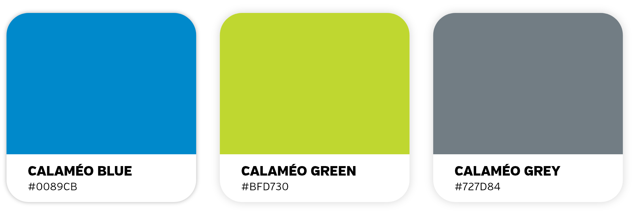
Examples of Calaméo’s color palette using the HEX values
Typeface
Another important element of the brand style guide is typeface. Typeface is the kind of lettering used in communications, which includes fonts. Does your company use only lowercase letters? All capitals? You must include the size, spacing, and color of your typeface in your style guide so employees know exactly how the typeface should look.
Work with a graphic designer to choose the best typeface for your company. Some brands even create their own fonts! Keep in mind that your typeface also reflects your tone– is it silly, serious, elevated? Your typeface must work well with the other elements of your style guide.
Images
Some brand style guidelines include rules about styles of images or photographs to use. These images must fit into the brand’s identity and remain consistent; you should not use a bright and airy photograph one day and then a dark and moody photograph the next. The rules could include using colors from the company’s color palette or desired emotions that the images should evoke (energetic, powerful, soothing). Images are available to download on sites like Getty Images, Shutterstock, or Unsplash, if your company does not have access to a photographer or photography studio to create your own images. However, make sure to check that you have the right to use the images.
Icons
Brand style guides may also include illustrations or icons. Consider the icons you see on a company’s website: a shopping cart to click on when you are ready to purchase or an envelope icon if you want to communicate with the company via email. These icons must be coherent across all platforms. Icons will, much like the rest of the elements of the style guide, reflect the brand identity. Whimsical, rigid, colorful, playful…your icons can express a lot about your brand!
A few of Calaméo’s icons
Tone
Your tone and voice give your brand a personality via the written word. Once you decide who you are, it should be easy to find your company’s tone The brand style guide may include different instructions depending on the channel– perhaps your social media tone will be slightly less formal than that of your advertisements, for example. The guide should include written examples so employees can see how to employ the tone in different situations. Think of the image you want to project, and stay consistent.
Applying your style guide to digital publications
So now that you know all about style guides, it’s time to apply this knowledge to your digital publications! Because digital publishing is a visual medium, consistent brand visuals make all the difference between an amateur-looking document and a professional-grade publication.
With Calaméo, you can personalize your viewer Theme, add your logo, and enrich your content yourself so that your digital publications match your brand identity. With our White Label feature for PLATINUM members, your publications appear in your name and image, without the Calaméo logo. Start your free trial today!

 Add a clear title
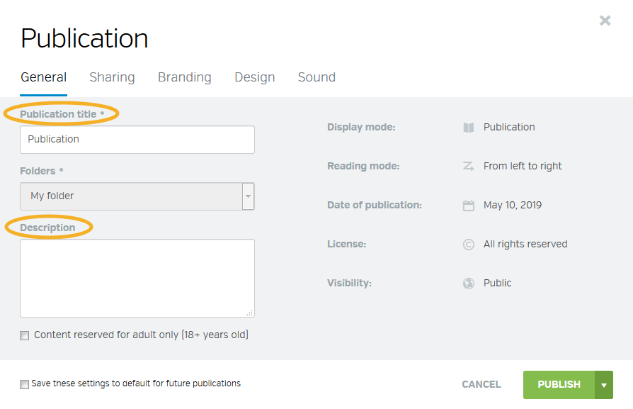
 Get descriptive
 Showcase bold covers
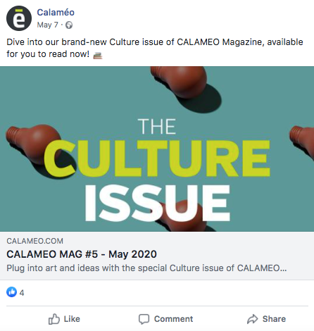
 Check privacy settings
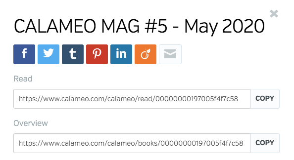
 Select link options
 Include hashtags