In the world of social media, Pinterest stands out. Instead of a chronological feed of posts, Pinterest shows its users a mix of content curated to reflect their interests.
Pinterest users can follow friends or topics like “Travel,” search for more specific subjects and create their own posts called “pins.” Then they save ideas for later by organizing posts on personalized boards. And there are a lot of them: more than 200 million Pinterest users have posted over 100 billion pins.
Although Pinterest is a little bit different it can be a great place to promote your business’s online publications. In this article we’ll explain three opportunities for digital publishers on Pinterest and how you can take advantage of them.
Drive Traffic
Don’t underestimate the power of pins to drive traffic: in 2017, Pinterest was the biggest social source of referrals after Facebook and has continued to show impressive growth. Creating pins that feature your publications is an easy way to help Pinterest users discover them.
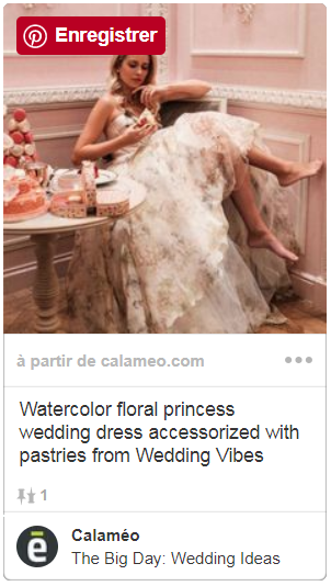
First set up a Pinterest profile, then get pinning! Since each pin on Pinterest has an image, a short description and a link, every post is a golden opportunity to bring more readers to your publication. Here’s an example from Wedding Vibes pinned to Calaméo’s page:
You can create posts in Pinterest or pin a publication directly from Calaméo—it’s a breeze! First, go to your account’s Publications tab, select Share for the title you want to pin and click on the Pinterest icon. This will take you to Pinterest, where you’ll be able to choose an image for your pin and add a description.
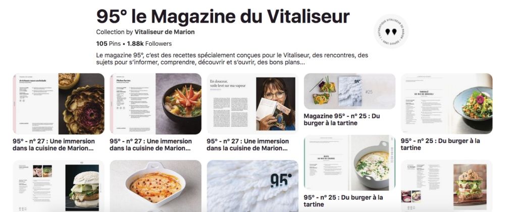
We recommend that digital publishers dedicate a board on their Pinterest profile to pinning every issue of their publication. This example shows how 95° Magazine encourages curious Pinterest users to browse its archives:
Get Audience Insights
Posting your digital publications to Pinterest as pins can grow your audience by bringing in new readers who find them in their feeds. But establishing a Pinterest profile for your business can bring you valuable insights about your existing audience, too.
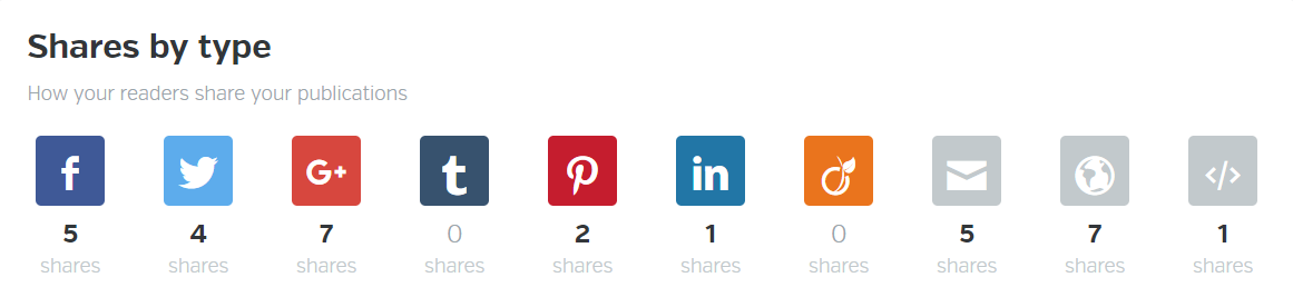
Chances are, your publications may already have been shared on Pinterest by your readers! Find out with the advanced statistics in our PLATINUM plan: our analytics include a breakdown of your publications’ social media shares by platform, so you can see how many times they have already been pinned.
The results might surprise you!
To get more information about your audience on Pinterest, we suggest that you set up your account with a business profile. This gives you access to statistics about your audience on Pinterest, including gender, location and interests. Armed with insights about your Calaméo readership and Pinterest reach, you can tailor your online publications to build stronger connections with your audience.
💡TIP: Connecting your Calaméo account to Google Analytics lets you analyze traffic from Pinterest to your publications in detail. Upgrade to PLATINUM to enjoy this feature!
Engage New Clients
Pinterest is a destination for users researching purchases. It has been estimated that 87 percent of the social network’s users have bought something that they saw on Pinterest first. This makes Pinterest a natural platform for posting products, but it’s also a reason to post inspiring content. Inspired users are more likely to become readers, who are more likely to become customers.
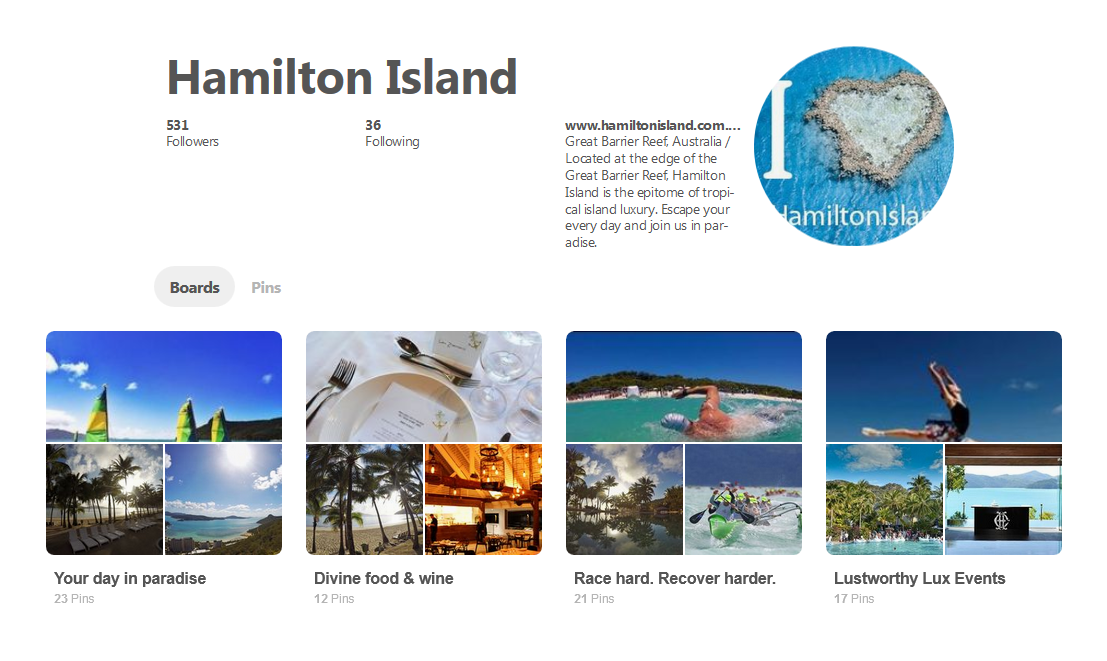
To make the most out of your business’s Pinterest presence, pin a variety of interesting material. Pinterest users look for vacation and travel planning, recipe ideas, professional development materials, home design and more. Try posting individual features, photos or articles from your publications to different boards, like in the example below from Hamilton Island:
Organizing your content by subject maximizes the appeal to potential readers and helps engage potential buyers.
These basics should give you some ideas for how to get started sharing your business’s digital publiations on Pinterest. We can’t wait to see you there!
We love covering social media here on the blog. Check out our tips for digital publishers on Facebook and YouTube, or have a look at our guide to polished shares on any social media network.
You can’t have missed it: in graphic design, the color blue is everywhere. It’s even the most popular color for logos! So, from turquoise to sapphire, cobalt to azure, let’s investigate why blue is so ubiquitous.
Here is a quick summary of the themes that we will cover in this article:
Let’s start with an accurate definition of the color blue.
Blue: a simple primary color?
As we learned early on at school: blue is a primary color. However, it’s not quite that simple. In the additive color model (or RGB for Red, Green, Blue), which is used to define the colors diffused on our screens on websites and digital communications, blue is indeed a primary color. Yet for printed materials, the primary blue shade used is actually a cyan tint (blue-green). The printing industry uses the subtractive color model, or CMYK for Cyan, Magenta, Yellow, Black.
The many hues of blue
Blue is a chromatic color, composed of hundreds of shades between green and violet.
Although blue is considered a cool color (as opposed to a warm red), shades of blue can be warmer or cooler depending on their undertones. The undertones are the secondary colors that are mixed with your blue: a little green will give you a peacock blue or teal, for example.
In addition, saturation also plays an important role: from a dull hue (blue-gray) to a vibrant hue (electric blue).
Finally, brightness will also determine your shade of blue: from a deep, dark shade like midnight blue, to a light shade like sky blue.
So, if you used to say that blue was your favorite color, you can now be more precise! As we have just seen, the range of blue is very wide. You probably have a preference between navy blue, pastel blue and electric blue!
💡TIP: The choice is yours! Be creative when choosing a shade of blue, don’t use a shade that is too close to your competitors’.
Blue and civilizations: history and perceptions
Now that we have defined the color blue, let’s begin to answer our question about the ubiquity of this color in graphic design by focusing on its history and its relationship to past and present civilizations.
A short history of the color blue
The birth of “blue”
This may surprise you, but blue was only born in the Middle Ages. Before that, neither its name nor its concept had been defined. In other words, blue was not a notion that existed at that time for human beings. However, this does not mean that there were no blue objects, just that blue was not considered a color in its own right. Anything blue was described with the colors that existed at the time. It’s very difficult to conceive of in this day and age!
A history of pigments
Blue is rarely found in nature, and natural blue pigments are therefore scarce. As a matter of fact, the only natural blue pigments come from indigo (a plant), pastel (a plant) and lapis lazuli (a mineral).
Civilizations quickly learned how to create synthetic blue pigments. The first of these was invented by the Egyptians in ancient times, called Egyptian blue. Prussian blue, Cobalt blue and Phthalocyanine blue are some other examples of synthetic blue pigments.
It is interesting to note that although blue did not yet have a name, human beings already seemed to be fascinated by this color to the point of trying to create pigments.
Blue and perceptions
Past perceptions
Today, blue is a color that is part of our daily lives, but this was not always the case. In ancient Rome, blue was despised: it was a symbol of ridicule and even associated with barbarians.
From the Middle Ages, the color took on a divine connotation and it started to appear on many religious works of art. It then became the color of the monarchy (of divine rights) a little later.
Finally, in the 20th century, all of humanity embraced the color blue when blue jeans came into fashion.
Current perceptions
As we have seen, depending on the era or culture, the feelings and connotations associated with certain colors can vary. Let’s take a look at current perceptions around the color blue.
In English, we say “feeling blue” to describe feelings of depression, but when we have “blue skies ahead” it means that we are optimistic about the future. In French, “être fleur bleue” means to be romantic or sentimental, and “avoir une peur bleue” means scared to death! So, blue can evoke several disparate images depending on the language.
Here are a few examples of different perceptions associated with the color blue:
Current universal perceptions
confidence
security
eternity
calm
peace
freedom
nostalgia
Specific cultural perceptions
nobility, royalty: royal blue, to have “blue blood”
workers: “blue collar” laborers, as opposed to “white collar” office workers
💡TIP: Although the feelings commonly associated with the color blue are calm and confidence, it is always a good idea to check the perception of each hue you plan to use in your communications against your target audience and their culture.
Blue in art
We couldn’t talk about blue in graphic design without also mentioning blue in art. Of course, graphic design draws inspiration from art! We can find blue in many works of art: from Van Gogh’s Starry Night to Hokusai’s The Great Wave to Andy Warhol’s Colored Mona Lisa.
So, while we will only cite a few interesting examples of the use of blue in art below, there are certainly many others.
The Jardin Majorelle
Have you heard of this villa and garden in Morocco, painted entirely in a special cobalt blue shade? It has become a very famous destination because it is so unique.
French painter Jacques Majorelle was inspired by Marrakesh and built a villa with its own botanical garden in the 1930s. But he did not stop there, he also created the “Majorelle blue” color and decided to paint the walls of his villa with it.
This garden has become a huge source of inspiration for artists and creatives, notably for French fashion designer Yves Saint-Laurent.
💡 REMEMBER: Use blue in bold, new, unexpected, and inspiring ways.
Yves Klein: IKB blue
Let’s focus now on another inventor of blue: Yves Klein. He is the creator of IKB blue, or International Klein Blue, a shade close to ultramarine blue. He is a visual artist who used his invention, the IKB, in many works, including monochrome, meaning using only this color.
💡 REMEMBER: You can use blue as a trademark, a unique blue that makes you recognizable.
Picasso: the Blue Period
Our final example of the use of blue in art is Picasso’s Blue Period from 1901 to 1904. Deeply affected by the death of a loved one, the young painter began to paint in shades of blue to express his grief.
💡 REMEMBER: Colors can relay messages and express feelings.
Blue in graphic design and brand visual identity
After our extensive theoretical overview on the color blue, which we hope will have convinced you of its importance, let’s move on to a practical study: how do brands use blue? Plus, how to use it well in your brand identity and, by extension, in your digital publications on Calaméo.
Because blue is humankind’s favorite color, it seems obvious that using it in your designs is a good idea since it will appeal to a very large portion of your clients and prospects. In addition, there are many positive associations with this color: confidence, peace, calm. People will associate your brand with these qualities instantly.
So, just by using blue in your brand style guide, the public will have a positive perception of your brand.
For the user experience
In graphic design, it’s important to focus on the user experience and make it as pleasant as possible for everyone. Blue being the color least affected by color vision disorders, it is a good choice for your graphic design.
Examples of blue in brand style guides
To help you use blue in your visual identity and in your communications, here are some interesting examples of the use of blue in brand style guides and good ideas to inspire your creativity.
Ikea: unmistakable
How can we talk about blue in graphic design without talking about Ikea? Ikea uses two strong colors that stand out and give a unique and recognizable visual identity. It’s probably the only furniture store that you are able to recognize from afar, wherever you are in the world, thanks to its blue and yellow sign and blue exterior.
💡 REMEMBER: Partner two strong colors that contrast, such as complementary colors, for a big impact. For example: combine blue with orange or yellow tones.
These distinctive colors reflect those of the Swedish flag. This choice reinforces Ikea’s brand identity: from the names of the products to the types of dishes offered in their restaurants to their brand style guide…all of these elements emphasize the company’s origins.
💡REMEMBER: Use specific colors to reinforce your brand identity.
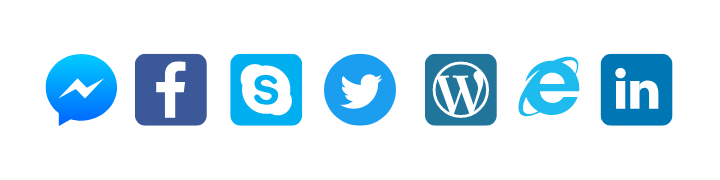
Major players on the web: all in shades of blue
Among the major Internet companies, almost all of their logos are blue. You can see some examples above. What at the beginning was perhaps a strategic choice seems to have turned into a trend. We can imagine that the choice of a blue logo of the first entities on the Internet reflects the desire to have an image of stability and confidence in this new virtual world that seemed ephemeral. As a result, blue logos are now associated with tech and web companies.
💡REMEMBER: Study your competitors and their brand style guides; if they all use the same codes, there may be a reason.
Calaméo: blue for emphasis
Finally, we wanted to tell you about our use of blue. Although blue is not our main color and does not appear in our logo, we do have a very specific use for it. We use blue to highlight and emphasize important messages. As you can see, on our blog the links are in blue and stand out.
💡REMEMBER: You can use a shade of blue in your graphic design without it being a main color. Do not hesitate to give it a specific function.
In this respect, many brands use blue in their visual identity, and the color performs different functions for each. From main color to accent color, it is a matter of finding the best way to incorporate this color in your style guide so that it completes your brand and identity.
Blue is a fascinating color: its history, its many uses in art, and all its different meanings and connotations. That’s why blue has become an essential color in graphic design.
Don’t hesitate to use it in your brand identity and in your digital publications. Blue used with ingenuity, in an original shade or in combination with unusual shades, will make you stand out and will make your content unforgettable.
Thanks to digital marketing, getting the word out about your business has never been easier. However, it often takes time for a potential customer to go from visiting your website to buying your product. A strategy to generate leads can help make sure that you identify interested users. Then, follow up and make the sale!
In this article, we will reveal simple ways to put your digital publications to work as lead generation tools.
The pop-up contact form is a classic method to generate leads online that we have mentioned before here on the blog.
While pop-up forms are a great choice, especially if you are producing exclusive content, they can be time-consuming to manage. Consider an even more streamlined, user-friendly approach: a smart Contact button.
Why does a Contact button help generate leads?
No matter what kind of content you are publishing digitally, you’ll want readers to be able to contact you as easily as possible. Our Editor lets you add links inside your publication for users to email or call your business.
Creating a Contact button makes an easy path from browsing your content to getting in touch. As a result, users benefit and you capture high-quality leads. In fact, this simple tool saves readers from having to:
return to your site
hunt for contact info
open their inbox
enter your email address
That’s a lot of work just to ask a question! Instead, potential customers are free to check out your publication, click your contact link and call or email you instantly.
How to add a Contact button to your publications
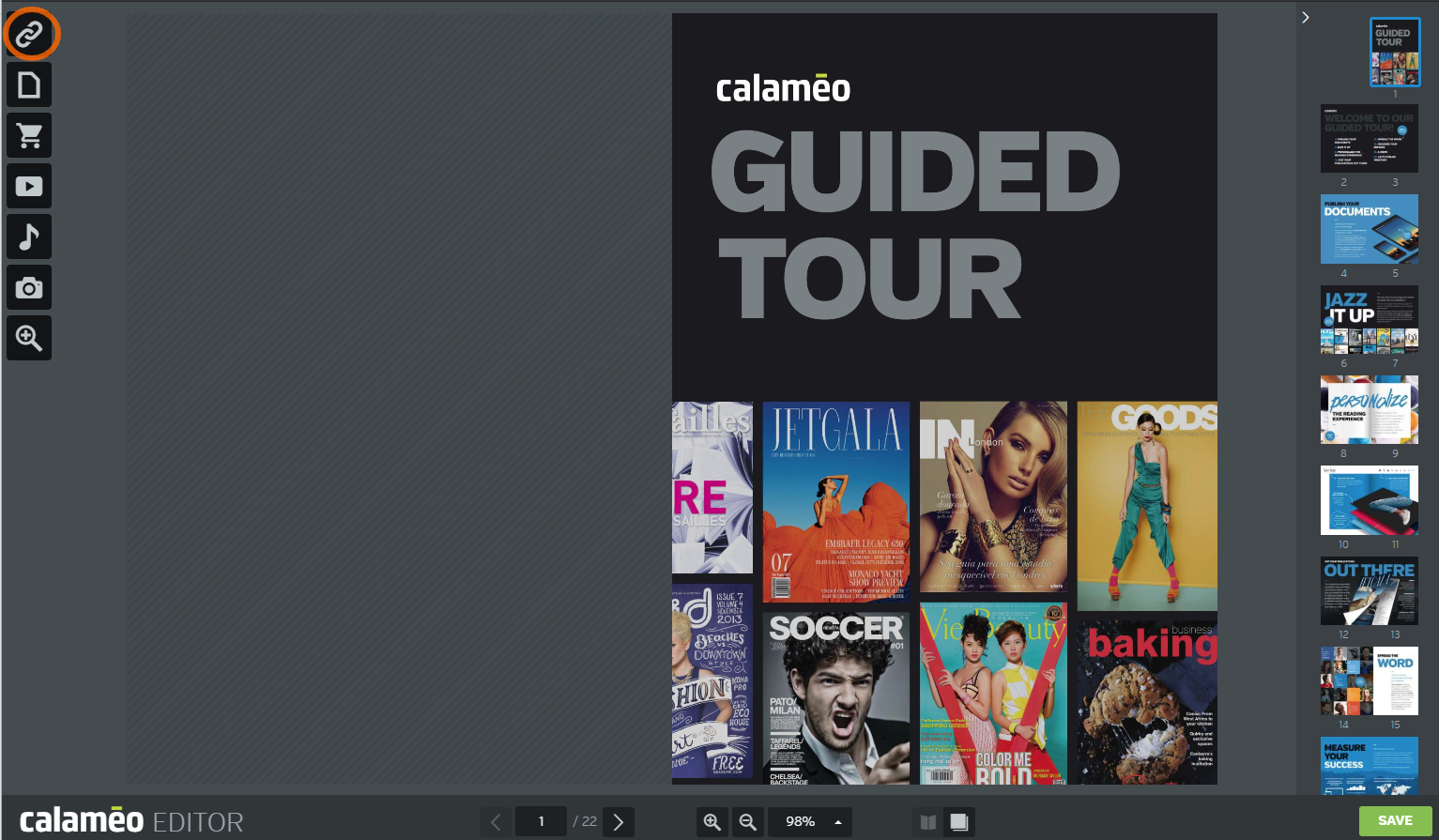
Once you have decided where your contact links will appear in your publication, all you need to do is open it with the Calaméo Editor.
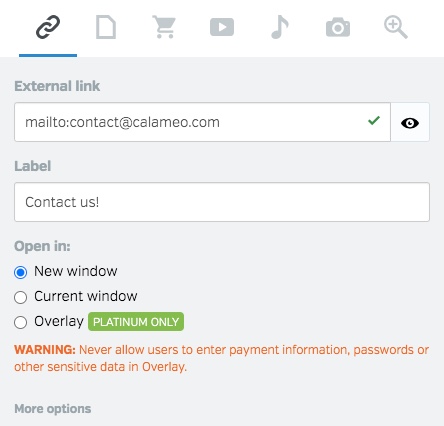
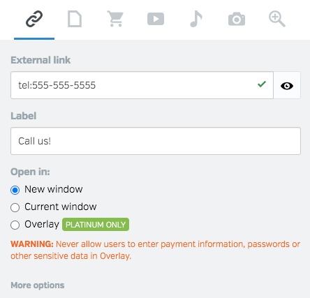
Next, select the External Link icon and draw a link in the place you’ve picked for a contact link.
To create an email message from your contact link, enter “mailto:” followed by your business’s email address in the External link field. If a reader clicks this link, her computer’s email client will open a new message to the chosen address.
To add a telephone link, enter “tel:” followed by your business’s phone number in the External link field. Your readers can place a call directly from your publication just by clicking the link!
💡 TIP: Note that telephone contact links are only authorized for devices with native telephone capabilities, such as tablets and smartphones. Email contact links work on any device.
How to add a Contact button to the viewer
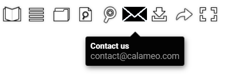
By investing a little extra time, you can also make use of contact links in our publication viewer to generate leads. We recommend creating a custom Skin to include a Contact button. Here’s an example in the toolbar of our Default:
You can learn more about how to design your own Skin on our Developers page or in our illustrated, step-by-step tutorial. Plus, making changes is easier than ever with our Elements feature, which lets you edit your publication’s viewer Skin right in your Calaméo account.
Whether you prefer a Contact button on the page or in the viewer, it’s a must-have for generating leads from your online content. And with Calaméo, you never have to sacrifice the immersive experience offered by digital publications for seamless customer contact.
In short, contact links are one more way that interactive digital publishing on Calaméo helps your business go beyond the PDF!
To try out these ideas to generate leads with digital publishing, request your 14-day PLATINUM Demo. You’ll enjoy access to all the great features of our professional plan, no credit card required.