
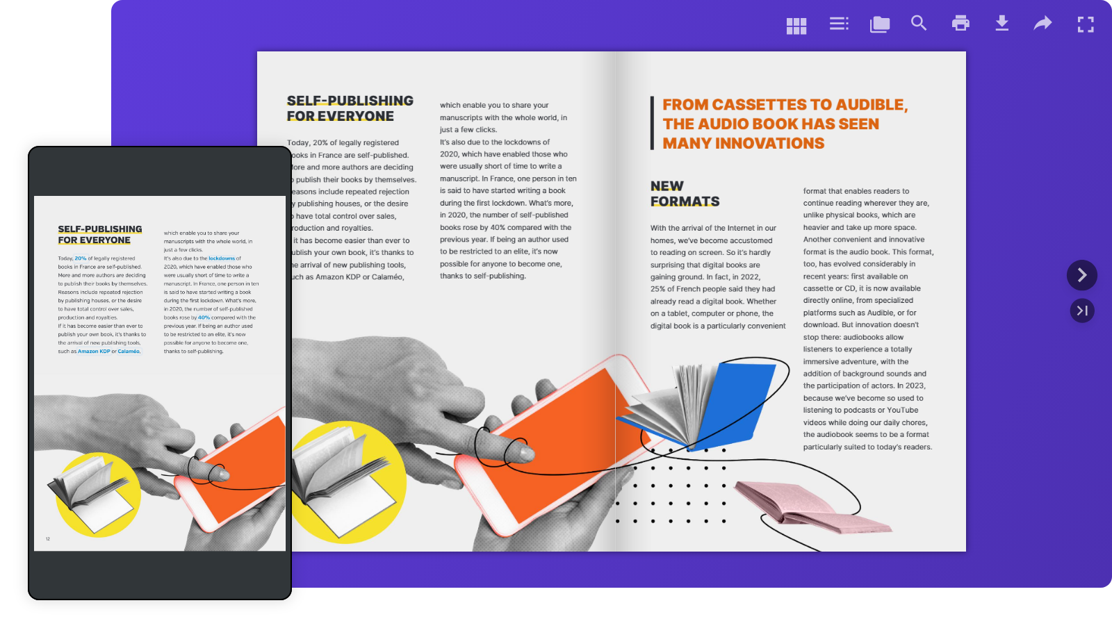
Your readers aren’t tied to one screen anymore. They move from laptops at work to smartphones on the go, tablets at home, and even smart TVs. That’s why making your digital content easy to read everywhere isn’t just nice to have—it’s essential. With Calaméo, your publications are always responsive by design, so your audience enjoys a smooth and intuitive experience on any device.
Responsive design on Calaméo: what does it mean?
Simply put, responsive design makes your publications flexible. They adapt automatically to any screen size—no extra effort required on your part. On Calaméo, this looks like:
- Layouts that resizes to fit each device
- Effortless navigation whether you’re on desktop or mobile
The benefits for your readers
- Comfortable reading, everywhere
Our mobile viewer adjusts perfectly to smaller screens, so browsing your publications feels natural. - Fewer drop-offs, more engagement
No pinching, zooming, or frustration. Just a smooth reading experience that keeps your audience engaged longer. - Always device-friendly
Every Calaméo publication is automatically optimized for all screens—no extra setup needed.
How Calaméo delivers a seamless reading experience
- Adjusted layout: your document is resized to fit the device.
- Smart navigation: Menus, buttons, and CTAs adjust to make the best use of available space.
Conclusion
With Calaméo, you don’t have to think about screen sizes—your publications are ready to shine everywhere by default. That means your readers get an enjoyable, stress-free experience, and you get more engagement, satisfaction, and visibility.
Ready to see it in action? Publish your next document on Calaméo and give your audience the smooth reading experience they expect—from desktop to mobile.
 Join millions of professionals already using Calaméo. Start your free 14-day trial of Calaméo PLATINUM today and unlock our full set of features.
 You can also read our Help Center article:
  Subscribe to