When it comes to the statistics you need most for your digital publications, views are probably the first thing that springs to mind. You want to know how often your publications are being read online in order to measure their success with your audience. But the advanced statistics offered by Calaméo let you access data to dig in much deeper and better understand the impact of your digital publications.
In this post, we’ll highlight three ways to make the most out of data for your online publications.
Focus on the fundamentals
Views are undeniably a key metric for anyone publishing digitally. It makes sense to check in on your publications and see how many times they have been displayed.
The more context you have for this information, however, the more valuable it will be to you. A longer data history means that you can distinguish a short-term decline in readership for one of your publications from its overall long-term growth, or even model month-to-month views. In the case of data for your digital publications, more is definitely more.
For more statistics, upgrade today: PREMIUM subscribers have access to six months of stats and PLATINUM subscribers enjoy an unlimited data history.
Expand your vision
Views may be the basics, but Calaméo’s statistics offer you a wealth of other information. Looking at data that you may not be taking into account yet can refresh your approach to analytics and reveal fresh insights into your readership.
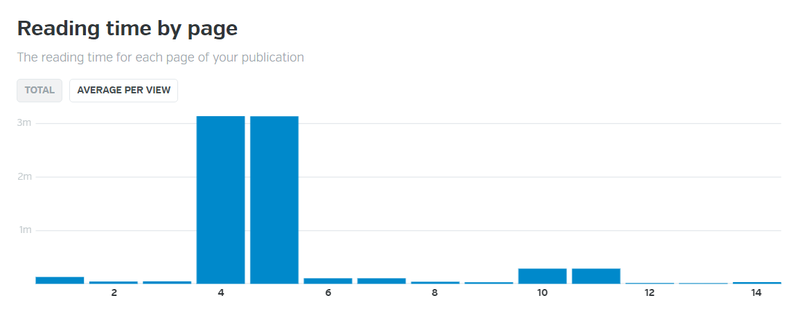
Stats like the average amount of time that readers spend on each page of your publication, or the time of day that your publication is most read may require a bit of interpretation, but they can help you understand your readers’ interaction with your documents.
A relatively even average reading time from page to page could indicate that readers tend to browse your publication. A clear spike in reading time on a particular page, however, suggests that readers are looking for specific information. Similarly, a noticeable peak in views at a certain time of day might correlate to an event mentioned in your publication as readers seek out the details. Add in the quantity, date and time of reader downloads and you begin to have a clearer picture of how your audience makes use of your digital publications.
Take action
So far we’ve talked about tips for looking at your Calaméo statistics. To take full advantage of your readership data, you can use it to try out changes in your own publications. Knowing what works will let you build on successful features and experiment with areas that you wish to improve.
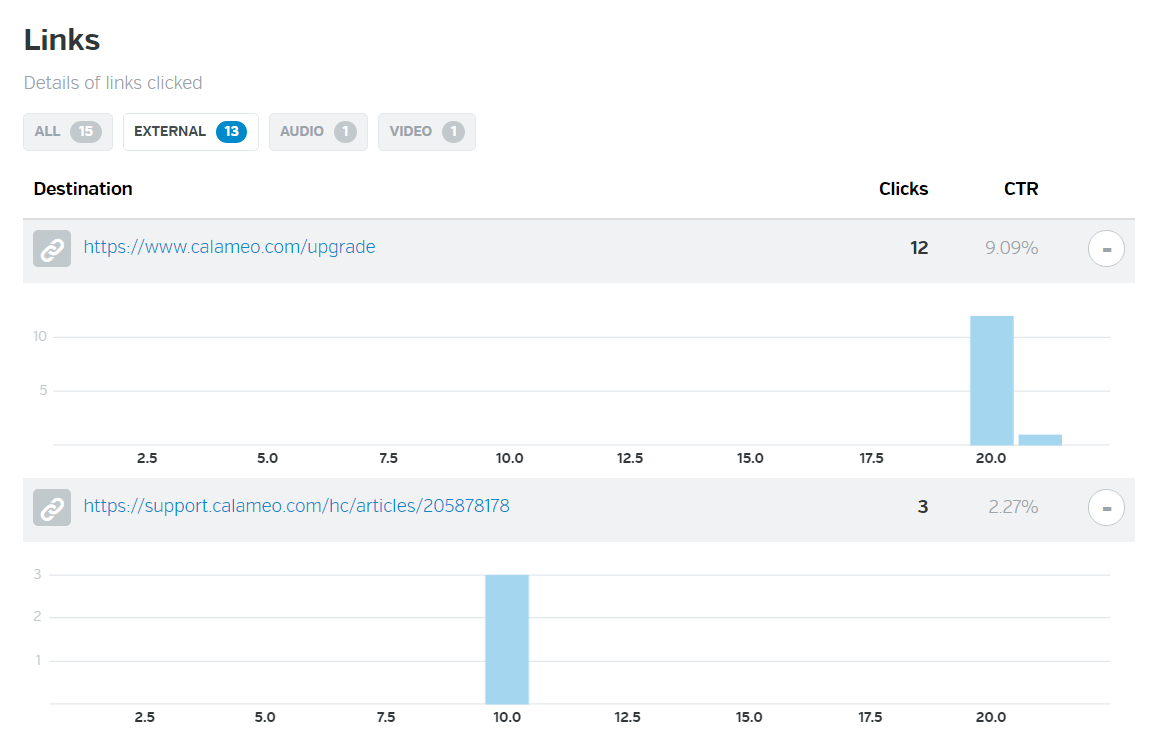
This applies not only to your content but also to an element of your publication such links. Our PLATINUM plan provides you with a detailed breakdown of clicks for your publications. You can view clicks on external links, audio and video elements in your documents, as well as the CTR (Click-Through Rate) automatically calculated for each.
We’ve already discussed how these statistics can be put to good use in your sales and marketing strategies. The data can also help you to maximize the performance of your external links. By testing different types of placement with our Editor, for example, you can determine how and where to position links most efficiently to engage your readers.
We hope that this post has inspired you to take a new look at how you use Calaméo’s readership statistics. Have any questions? Check out our Help Center or write us anytime at contact@calameo.com.
You can’t have missed it: in graphic design, the color blue is everywhere. It’s even the most popular color for logos! So, from turquoise to sapphire, cobalt to azure, let’s investigate why blue is so ubiquitous.
Here is a quick summary of the themes that we will cover in this article:
Let’s start with an accurate definition of the color blue.
Blue: a simple primary color?
As we learned early on at school: blue is a primary color. However, it’s not quite that simple. In the additive color model (or RGB for Red, Green, Blue), which is used to define the colors diffused on our screens on websites and digital communications, blue is indeed a primary color. Yet for printed materials, the primary blue shade used is actually a cyan tint (blue-green). The printing industry uses the subtractive color model, or CMYK for Cyan, Magenta, Yellow, Black.
The many hues of blue
Blue is a chromatic color, composed of hundreds of shades between green and violet.
Although blue is considered a cool color (as opposed to a warm red), shades of blue can be warmer or cooler depending on their undertones. The undertones are the secondary colors that are mixed with your blue: a little green will give you a peacock blue or teal, for example.
In addition, saturation also plays an important role: from a dull hue (blue-gray) to a vibrant hue (electric blue).
Finally, brightness will also determine your shade of blue: from a deep, dark shade like midnight blue, to a light shade like sky blue.
So, if you used to say that blue was your favorite color, you can now be more precise! As we have just seen, the range of blue is very wide. You probably have a preference between navy blue, pastel blue and electric blue!
💡TIP: The choice is yours! Be creative when choosing a shade of blue, don’t use a shade that is too close to your competitors’.
Blue and civilizations: history and perceptions
Now that we have defined the color blue, let’s begin to answer our question about the ubiquity of this color in graphic design by focusing on its history and its relationship to past and present civilizations.
A short history of the color blue
The birth of “blue”
This may surprise you, but blue was only born in the Middle Ages. Before that, neither its name nor its concept had been defined. In other words, blue was not a notion that existed at that time for human beings. However, this does not mean that there were no blue objects, just that blue was not considered a color in its own right. Anything blue was described with the colors that existed at the time. It’s very difficult to conceive of in this day and age!
A history of pigments
Blue is rarely found in nature, and natural blue pigments are therefore scarce. As a matter of fact, the only natural blue pigments come from indigo (a plant), pastel (a plant) and lapis lazuli (a mineral).
Civilizations quickly learned how to create synthetic blue pigments. The first of these was invented by the Egyptians in ancient times, called Egyptian blue. Prussian blue, Cobalt blue and Phthalocyanine blue are some other examples of synthetic blue pigments.
It is interesting to note that although blue did not yet have a name, human beings already seemed to be fascinated by this color to the point of trying to create pigments.
Blue and perceptions
Past perceptions
Today, blue is a color that is part of our daily lives, but this was not always the case. In ancient Rome, blue was despised: it was a symbol of ridicule and even associated with barbarians.
From the Middle Ages, the color took on a divine connotation and it started to appear on many religious works of art. It then became the color of the monarchy (of divine rights) a little later.
Finally, in the 20th century, all of humanity embraced the color blue when blue jeans came into fashion.
Current perceptions
As we have seen, depending on the era or culture, the feelings and connotations associated with certain colors can vary. Let’s take a look at current perceptions around the color blue.
In English, we say “feeling blue” to describe feelings of depression, but when we have “blue skies ahead” it means that we are optimistic about the future. In French, “être fleur bleue” means to be romantic or sentimental, and “avoir une peur bleue” means scared to death! So, blue can evoke several disparate images depending on the language.
Here are a few examples of different perceptions associated with the color blue:
Current universal perceptions
confidence
security
eternity
calm
peace
freedom
nostalgia
Specific cultural perceptions
nobility, royalty: royal blue, to have “blue blood”
workers: “blue collar” laborers, as opposed to “white collar” office workers
💡TIP: Although the feelings commonly associated with the color blue are calm and confidence, it is always a good idea to check the perception of each hue you plan to use in your communications against your target audience and their culture.
Blue in art
We couldn’t talk about blue in graphic design without also mentioning blue in art. Of course, graphic design draws inspiration from art! We can find blue in many works of art: from Van Gogh’s Starry Night to Hokusai’s The Great Wave to Andy Warhol’s Colored Mona Lisa.
So, while we will only cite a few interesting examples of the use of blue in art below, there are certainly many others.
The Jardin Majorelle
Have you heard of this villa and garden in Morocco, painted entirely in a special cobalt blue shade? It has become a very famous destination because it is so unique.
French painter Jacques Majorelle was inspired by Marrakesh and built a villa with its own botanical garden in the 1930s. But he did not stop there, he also created the “Majorelle blue” color and decided to paint the walls of his villa with it.
This garden has become a huge source of inspiration for artists and creatives, notably for French fashion designer Yves Saint-Laurent.
💡 REMEMBER: Use blue in bold, new, unexpected, and inspiring ways.
Yves Klein: IKB blue
Let’s focus now on another inventor of blue: Yves Klein. He is the creator of IKB blue, or International Klein Blue, a shade close to ultramarine blue. He is a visual artist who used his invention, the IKB, in many works, including monochrome, meaning using only this color.
💡 REMEMBER: You can use blue as a trademark, a unique blue that makes you recognizable.
Picasso: the Blue Period
Our final example of the use of blue in art is Picasso’s Blue Period from 1901 to 1904. Deeply affected by the death of a loved one, the young painter began to paint in shades of blue to express his grief.
💡 REMEMBER: Colors can relay messages and express feelings.
Blue in graphic design and brand visual identity
After our extensive theoretical overview on the color blue, which we hope will have convinced you of its importance, let’s move on to a practical study: how do brands use blue? Plus, how to use it well in your brand identity and, by extension, in your digital publications on Calaméo.
Because blue is humankind’s favorite color, it seems obvious that using it in your designs is a good idea since it will appeal to a very large portion of your clients and prospects. In addition, there are many positive associations with this color: confidence, peace, calm. People will associate your brand with these qualities instantly.
So, just by using blue in your brand style guide, the public will have a positive perception of your brand.
For the user experience
In graphic design, it’s important to focus on the user experience and make it as pleasant as possible for everyone. Blue being the color least affected by color vision disorders, it is a good choice for your graphic design.
Examples of blue in brand style guides
To help you use blue in your visual identity and in your communications, here are some interesting examples of the use of blue in brand style guides and good ideas to inspire your creativity.
Ikea: unmistakable
How can we talk about blue in graphic design without talking about Ikea? Ikea uses two strong colors that stand out and give a unique and recognizable visual identity. It’s probably the only furniture store that you are able to recognize from afar, wherever you are in the world, thanks to its blue and yellow sign and blue exterior.
💡 REMEMBER: Partner two strong colors that contrast, such as complementary colors, for a big impact. For example: combine blue with orange or yellow tones.
These distinctive colors reflect those of the Swedish flag. This choice reinforces Ikea’s brand identity: from the names of the products to the types of dishes offered in their restaurants to their brand style guide…all of these elements emphasize the company’s origins.
💡REMEMBER: Use specific colors to reinforce your brand identity.
Major players on the web: all in shades of blue
Among the major Internet companies, almost all of their logos are blue. You can see some examples above. What at the beginning was perhaps a strategic choice seems to have turned into a trend. We can imagine that the choice of a blue logo of the first entities on the Internet reflects the desire to have an image of stability and confidence in this new virtual world that seemed ephemeral. As a result, blue logos are now associated with tech and web companies.
💡REMEMBER: Study your competitors and their brand style guides; if they all use the same codes, there may be a reason.
Calaméo: blue for emphasis
Finally, we wanted to tell you about our use of blue. Although blue is not our main color and does not appear in our logo, we do have a very specific use for it. We use blue to highlight and emphasize important messages. As you can see, on our blog the links are in blue and stand out.
💡REMEMBER: You can use a shade of blue in your graphic design without it being a main color. Do not hesitate to give it a specific function.
In this respect, many brands use blue in their visual identity, and the color performs different functions for each. From main color to accent color, it is a matter of finding the best way to incorporate this color in your style guide so that it completes your brand and identity.
Blue is a fascinating color: its history, its many uses in art, and all its different meanings and connotations. That’s why blue has become an essential color in graphic design.
Don’t hesitate to use it in your brand identity and in your digital publications. Blue used with ingenuity, in an original shade or in combination with unusual shades, will make you stand out and will make your content unforgettable.
By now, the advantages of digital communications are obvious to almost everyone. Thanks to tools like email, online publishing and social media, it’s fast and easy to get your message out there. In fact, the explosive growth of digital channels is overtaking traditional ways of doing things. From meetings to marketing, online options are on top.
However, there are also some disadvantages to common forms of digital communication. For example, they often rely heavily on text. And while text-heavy formats like email are efficient, they aren’t as good at creating trust and engagement in their audience. According to media richness theory, contextual elements enhance those features and improve the quality of communication.
In other words, considering when to use enriched media can have big benefits for your digital communication. But how exactly can you create richer documents to engage your readers? Our guide has three great ideas to get you started.
Step 1: Interactivity
To take advantage of rich media in your communications, interactivity is the most important value. Don’t be fooled by its sometimes gimmicky history! Today, interactive features encourage distracted Internet users to go beyond skimming. Instead of passive scrolling, digital publications require readers to stop, think and click through for active browsing.
Even the pageflip effect helps to enrich your communications, via the concept of skeuomorphic design. Unlike the flat design style, skeuomorphism incorporates shapes and textures from real objects in digital interfaces. Because they’re more detailed than flat buttons and grids, skeuomorphic elements catch your eye. The interactive interface of an online publication can make your message stand out—and engage your audience’s attention.
Of course, you can add many other interactive features to your digital publications. For instance, external links let your readers follow up on CTAs in one click. But to get the most out of enriched media, you’ll need to consider including audio and video alongside images and text.
Step 2: Audio
Compared to written communication, it’s not hard to understand why audio is a “richer” format. Think of all the things that a phone call has versus an email: the speaker’s pauses, hesitations, laughs and above all, the tone of voice. These signals let the person listening to interpret and process the message better than with just the words.
Luckily, digital tools have made audio content extremely easy to produce and integrate into your communications. To record a voice clip or podcast, all you need is a microphone and simple editing software. Once you’re happy with the sound, upload the file to a hosting platform like SoundCloud. Then, add it to your online publication for readers to click and play.
If you’re wondering what kind of audio content to include, don’t be afraid to get creative. You can boost the impact of any message by providing an audio version. For example, try having your company president record her message to shareholders inside your annual report. Or explore the conversational side of audio and integrate a podcast into your digital publication. Since users can’t get enough audio, the possibilities are endless!
Step 3: Video
Although audio is booming, there’s one great reason to choose video to enrich your communications. That’s because in media richness theory, video is the top option. In addition to audio signals, video gives your audience visual information like movement and body language. In digital terms, video communication comes as close as possible to the engagement of a real-life experience.
Unfortunately, the infamous “pivot to video” convinced many businesses that video was too expensive an investment. And indeed, high-quality video content does take time and resources to produce. But that doesn’t mean your online communications strategy should write off video. Instead, think again about the kinds of video you can prioritize.
Three simple but extremely effective ideas include product demonstrations, tutorials and calls to action. All of these make the most out of video’s strongest features to enrich your digital publications: visual action and human presence. When your audience watches another person ask them to sign up, or show them how to, they can connect more deeply with the message.
To sum it up, media richness theory has a lot to tell us about how to communicate with audiences online. Used wisely, enriched media like digital publications can be a powerful tool for creating memorable content and developing audience relationships.
And if you want to see for yourself, why not request your two-week demo of our PLATINUM plan? You’ll enjoy access to all the professional enrichment features of Calaméo’s digital publishing solution—absolutely free.


 Focus on the fundamentals
 Expand your vision
 Take action