User appetite for content is stronger than ever as consumers demand access to information, anytime and everywhere. Due to these expectations, digital publishing has quickly become an essential part of business models around the world. In this article, we’ll explore 6 effective ways digital publications can prove useful in your sales and marketing strategies. Plus, see great examples of how Calaméo can help you implement them!
Utilize email marketing and newsletters
Creating attractive email newsletters for your clients can be a major asset to your marketing strategy. That’s because it allows you to reach a place that most people use every day—their inbox. You can optimize this platform even further by promoting valuable content up front to your readers with digital publications.
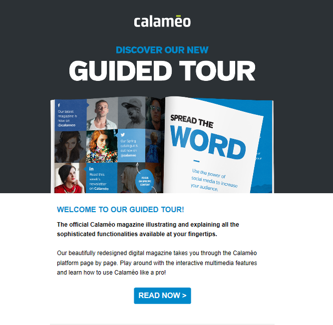
🔎 EXAMPLE: We see below how the Calaméo marketing team used an email newsletter creatively to promote the Guided Tour digital publication. Note the use of descriptive text and bold graphics for maximum impact.
Optimize advertisements
The best sales and marketing strategies leverage technology to convert audiences into buyers. With online publications you can link your readers directly to your advertiser’s website by using the Calaméo Editor. Instead of relying on your readers to have enough interest to remember to search the information displayed in a print advertisement, one simple link gets your reader to the ad in seconds.
Offer a window to your brand
Of course, you already have a website where you drive traffic via organic search, convert visitors to email subscribers and sell your numerous products. But don’t forget to showcase digital publications there, too!
Online content consumption is at an all-time high. So displaying digital publications on your website is a great opportunity to get your message across to a target audience. This will also build credibility in the eyes of potential customers. You can compile all of your online publications in your very own newsstand with the Calaméo library widget. Create a window to your brand and maximize the power of your digital content—a clever marketing tactic!
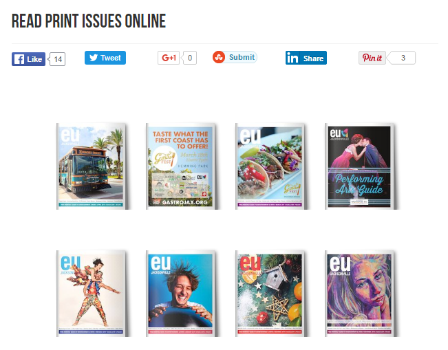
🔎 EXAMPLE: Here is how our client EU Jacksonville makes their publications consultable via their website:
Content lead generation
Content is king and can prove very effective in your sales and marketing strategies if executed successfully. Releasing digital publications can be highly useful for lead generation. Because they provide value up front, this content can help educate potential leads and showcase your product or service in a creative way.
💡TIP: Calaméo offers PREMIUM and PLATINUM users the possibility to add elements to digital publications to help make the content more accessible and improve the user experience.
🔎 EXAMPLE: The town of Asnières, France has allowed for easy offline reading of their newsletter by enabling the share, download, and print options. When you click on the publication, you will see all of these options available in the upper right-hand corner of the viewer.
Leverage videos
Today, video is a key element to any marketing and sales strategy. Marketers who fail to capitalize on this do so at their own risk!
Videos are naturally engaging and attention-grabbing. In an age of information overload, it’s important for marketers to offer content that is easy to digest. Calaméo enables PLATINUM users to insert Vimeo, Dailymotion, or YouTube videos in their digital publications to boost conversions and to offer a rich multimedia reading experience.
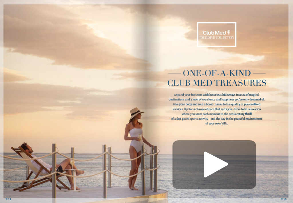
🔎 EXAMPLE: The Club Med Trident magazine uses video effectively to complement the content in their digital publication:
Include strategic CTAs
Calls to Action (CTAs) in your digital publications guide your readers through the buying journey and can turn visitors into loyal customers. The Calaméo Editor enables you to create links within the pages of your digital publications. This feature can be used to encourage “soft” actions (e.g., driving the user to another piece of content) or to promote an actionable next step (e.g., Subscribe to our YouTube channel now).
🔎 EXAMPLE:Cambridge University Press encourages readers to “Start your free trial” of their learning platform using a CTA that links to their website:
There you have it. We hope you can see just how important digital publications can be for your sales and marketing strategies!
Thanks to social media, delivering content to thousands of people at once is as easy as hitting the “Post” button. But it isn’t always easy to achieve the results you have in mind. That’s why we’re bringing you a new series all about making these channels work for your digital publishing needs. Next up: how to promote content with Pinterest.
Why use Pinterest to promote content?
If Pinterest has been flying under your radar until now, it’s time to consider signing up. The last time we talked about Pinterest marketing on the blog in 2018, there were 200 million users. By the middle of 2020, that number grew to more than 442 million users around the world—an impressive 121% increase in just over two years.
For those who haven’t yet tried to promote content with Pinterest, its role as an inspiration hub for users offers several advantages. According to Pinterest’s research, over 90% of its users turn to Pinterest for inspiration. But they don’t just daydream. More than 80% use Pinterest to make shopping decisions and more than 70% discover new products and brands there. Plus, users love Pinterest: it ranked first in a 2019 survey of customer satisfaction with social networks.
However, Pinterest is not exactly a social network. Despite serving as source of inspiration like Instagram, Pinterest acts more as a search engine than a photo feed. Users, or Pinners, search for ideas among the billions of posts, or pins, that have been saved to the platform. Then, they curate their favorites on personal boards. To reach these Pinners, you’ll want to read through our tips and promote content with Pinterest.
Pinning for publishers
Although Pinterest is easy to use, you may need a little time to get used to its vocabulary and set up your profile. If you are creating a Pinterest account for a business, first claim your company’s website. Because pins can be created from content found almost anywhere across the internet as well as uploaded individually, claiming your website will help you identify pins already saved from your site.
Once you’ve registered your business profile and filled it out, you can get started pinning. Basic uploaded pins can contain a title, description, image and external link. And to promote content with Pinterest effectively, keeping search in mind is essential.
Similarly to classic SEO, you should focus on choosing keywords related to your content and include them in the titles and descriptions of your pins. An eye-catching visual is also a must to stand out in Pinterest search results. Imagine what kind of searches Pinners are making that could lead them to your content, then tailor your pins to help them find it.
In addition to creating individual pins, you can create groups of pins called boards to display on your business profile. Boards make your Pinterest profile more attractive and easier to browse by packaging pins into different collections. Try resaving pins posted by other users to supplement your own content and consider adding video, article or product pins to enrich your boards.
Digital publishers can promote content with Pinterest in lots of ways. For example, build out a new board around each new release with pins related to your publication’s content. Use boards to house your publication archives or link shoppable boards to your ecommerce strategy.
Audience participation
After setting up your business profile and pinning your content, you’ll be able to take advantage of Pinterest’s account statistics. While your Analytics has lots of interesting information, the first thing you should check is your top pins. Seeing which of your pinned content has the most engagements, link clicks and saves can give you a good idea of what works best on Pinterest.
Next, continue to refine how you promote content with Pinterest going forward. You can use insights about your most successful pins as a model for fresh posts, but don’t be afraid to experiment as well! For best results, add new pins regularly to your existing boards. Unlike most other social networks, Pinterest content tends to be evergreen. That means pins don’t disappear from user feeds like tweets and updates. Instead, they can turn up in search results and on Pinners’ boards for months or even years.
As a result, you should always keep an eye on your older pins. Make sure that none of them redirect to broken links, since Pinterest can be a key source of traffic to your website. You can also repost content with updated images, titles or description text if you want to give certain publications a boost. No matter what kind of digital publications you have to promote, Pinterest can be a powerful platform to help new users discover them.
Ready to start?
Now that you’ve got all the details about how to promote content with Pinterest, it’s time to turn your online documents into great digital publications. Sign up for your free Calaméo account today and explore what digital publishing can do for you!
You can’t have missed it: in graphic design, the color blue is everywhere. It’s even the most popular color for logos! So, from turquoise to sapphire, cobalt to azure, let’s investigate why blue is so ubiquitous.
Here is a quick summary of the themes that we will cover in this article:
Let’s start with an accurate definition of the color blue.
Blue: a simple primary color?
As we learned early on at school: blue is a primary color. However, it’s not quite that simple. In the additive color model (or RGB for Red, Green, Blue), which is used to define the colors diffused on our screens on websites and digital communications, blue is indeed a primary color. Yet for printed materials, the primary blue shade used is actually a cyan tint (blue-green). The printing industry uses the subtractive color model, or CMYK for Cyan, Magenta, Yellow, Black.
The many hues of blue
Blue is a chromatic color, composed of hundreds of shades between green and violet.
Although blue is considered a cool color (as opposed to a warm red), shades of blue can be warmer or cooler depending on their undertones. The undertones are the secondary colors that are mixed with your blue: a little green will give you a peacock blue or teal, for example.
In addition, saturation also plays an important role: from a dull hue (blue-gray) to a vibrant hue (electric blue).
Finally, brightness will also determine your shade of blue: from a deep, dark shade like midnight blue, to a light shade like sky blue.
So, if you used to say that blue was your favorite color, you can now be more precise! As we have just seen, the range of blue is very wide. You probably have a preference between navy blue, pastel blue and electric blue!
💡TIP: The choice is yours! Be creative when choosing a shade of blue, don’t use a shade that is too close to your competitors’.
Blue and civilizations: history and perceptions
Now that we have defined the color blue, let’s begin to answer our question about the ubiquity of this color in graphic design by focusing on its history and its relationship to past and present civilizations.
A short history of the color blue
The birth of “blue”
This may surprise you, but blue was only born in the Middle Ages. Before that, neither its name nor its concept had been defined. In other words, blue was not a notion that existed at that time for human beings. However, this does not mean that there were no blue objects, just that blue was not considered a color in its own right. Anything blue was described with the colors that existed at the time. It’s very difficult to conceive of in this day and age!
A history of pigments
Blue is rarely found in nature, and natural blue pigments are therefore scarce. As a matter of fact, the only natural blue pigments come from indigo (a plant), pastel (a plant) and lapis lazuli (a mineral).
Civilizations quickly learned how to create synthetic blue pigments. The first of these was invented by the Egyptians in ancient times, called Egyptian blue. Prussian blue, Cobalt blue and Phthalocyanine blue are some other examples of synthetic blue pigments.
It is interesting to note that although blue did not yet have a name, human beings already seemed to be fascinated by this color to the point of trying to create pigments.
Blue and perceptions
Past perceptions
Today, blue is a color that is part of our daily lives, but this was not always the case. In ancient Rome, blue was despised: it was a symbol of ridicule and even associated with barbarians.
From the Middle Ages, the color took on a divine connotation and it started to appear on many religious works of art. It then became the color of the monarchy (of divine rights) a little later.
Finally, in the 20th century, all of humanity embraced the color blue when blue jeans came into fashion.
Current perceptions
As we have seen, depending on the era or culture, the feelings and connotations associated with certain colors can vary. Let’s take a look at current perceptions around the color blue.
In English, we say “feeling blue” to describe feelings of depression, but when we have “blue skies ahead” it means that we are optimistic about the future. In French, “être fleur bleue” means to be romantic or sentimental, and “avoir une peur bleue” means scared to death! So, blue can evoke several disparate images depending on the language.
Here are a few examples of different perceptions associated with the color blue:
Current universal perceptions
confidence
security
eternity
calm
peace
freedom
nostalgia
Specific cultural perceptions
nobility, royalty: royal blue, to have “blue blood”
workers: “blue collar” laborers, as opposed to “white collar” office workers
💡TIP: Although the feelings commonly associated with the color blue are calm and confidence, it is always a good idea to check the perception of each hue you plan to use in your communications against your target audience and their culture.
Blue in art
We couldn’t talk about blue in graphic design without also mentioning blue in art. Of course, graphic design draws inspiration from art! We can find blue in many works of art: from Van Gogh’s Starry Night to Hokusai’s The Great Wave to Andy Warhol’s Colored Mona Lisa.
So, while we will only cite a few interesting examples of the use of blue in art below, there are certainly many others.
The Jardin Majorelle
Have you heard of this villa and garden in Morocco, painted entirely in a special cobalt blue shade? It has become a very famous destination because it is so unique.
French painter Jacques Majorelle was inspired by Marrakesh and built a villa with its own botanical garden in the 1930s. But he did not stop there, he also created the “Majorelle blue” color and decided to paint the walls of his villa with it.
This garden has become a huge source of inspiration for artists and creatives, notably for French fashion designer Yves Saint-Laurent.
💡 REMEMBER: Use blue in bold, new, unexpected, and inspiring ways.
Yves Klein: IKB blue
Let’s focus now on another inventor of blue: Yves Klein. He is the creator of IKB blue, or International Klein Blue, a shade close to ultramarine blue. He is a visual artist who used his invention, the IKB, in many works, including monochrome, meaning using only this color.
💡 REMEMBER: You can use blue as a trademark, a unique blue that makes you recognizable.
Picasso: the Blue Period
Our final example of the use of blue in art is Picasso’s Blue Period from 1901 to 1904. Deeply affected by the death of a loved one, the young painter began to paint in shades of blue to express his grief.
💡 REMEMBER: Colors can relay messages and express feelings.
Blue in graphic design and brand visual identity
After our extensive theoretical overview on the color blue, which we hope will have convinced you of its importance, let’s move on to a practical study: how do brands use blue? Plus, how to use it well in your brand identity and, by extension, in your digital publications on Calaméo.
Because blue is humankind’s favorite color, it seems obvious that using it in your designs is a good idea since it will appeal to a very large portion of your clients and prospects. In addition, there are many positive associations with this color: confidence, peace, calm. People will associate your brand with these qualities instantly.
So, just by using blue in your brand style guide, the public will have a positive perception of your brand.
For the user experience
In graphic design, it’s important to focus on the user experience and make it as pleasant as possible for everyone. Blue being the color least affected by color vision disorders, it is a good choice for your graphic design.
Examples of blue in brand style guides
To help you use blue in your visual identity and in your communications, here are some interesting examples of the use of blue in brand style guides and good ideas to inspire your creativity.
Ikea: unmistakable
How can we talk about blue in graphic design without talking about Ikea? Ikea uses two strong colors that stand out and give a unique and recognizable visual identity. It’s probably the only furniture store that you are able to recognize from afar, wherever you are in the world, thanks to its blue and yellow sign and blue exterior.
💡 REMEMBER: Partner two strong colors that contrast, such as complementary colors, for a big impact. For example: combine blue with orange or yellow tones.
These distinctive colors reflect those of the Swedish flag. This choice reinforces Ikea’s brand identity: from the names of the products to the types of dishes offered in their restaurants to their brand style guide…all of these elements emphasize the company’s origins.
💡REMEMBER: Use specific colors to reinforce your brand identity.
Major players on the web: all in shades of blue
Among the major Internet companies, almost all of their logos are blue. You can see some examples above. What at the beginning was perhaps a strategic choice seems to have turned into a trend. We can imagine that the choice of a blue logo of the first entities on the Internet reflects the desire to have an image of stability and confidence in this new virtual world that seemed ephemeral. As a result, blue logos are now associated with tech and web companies.
💡REMEMBER: Study your competitors and their brand style guides; if they all use the same codes, there may be a reason.
Calaméo: blue for emphasis
Finally, we wanted to tell you about our use of blue. Although blue is not our main color and does not appear in our logo, we do have a very specific use for it. We use blue to highlight and emphasize important messages. As you can see, on our blog the links are in blue and stand out.
💡REMEMBER: You can use a shade of blue in your graphic design without it being a main color. Do not hesitate to give it a specific function.
In this respect, many brands use blue in their visual identity, and the color performs different functions for each. From main color to accent color, it is a matter of finding the best way to incorporate this color in your style guide so that it completes your brand and identity.
Blue is a fascinating color: its history, its many uses in art, and all its different meanings and connotations. That’s why blue has become an essential color in graphic design.
Don’t hesitate to use it in your brand identity and in your digital publications. Blue used with ingenuity, in an original shade or in combination with unusual shades, will make you stand out and will make your content unforgettable.