As the amount of content available online continues to grow, the most effective ways to be discovered from a simple search are changing. The basics of SEO in 2020 are still simple. Your content should be fully indexed, easy to link to and from and include relevant keywords in titles, descriptions and even URLs.
If you’re publishing your content digitally on Calaméo, you’re in luck—all of that is a snap to accomplish. So we decided to go a step further and look at some of the biggest new trends in search engine optimization strategy. Keep reading for the five things you need to know about SEO in 2020, as well as our best tips for your business.
SEO in 2020: Emerging Trends
MOBILE SEARCH
Our first pick for SEO in 2020 goes beyond just being mobile-friendly. Last year, 55% of all internet traffic came from smartphones and tablets. As a result, all of your content from blog posts to product catalogs should always be responsive. But to take advantage of the 58% of searches happening on mobile, every related element needs to be optimized for phones. Titles, descriptions and embeds should sized to display correctly on smaller screens so readers can more easily find and explore your content.
VOICE SEARCH
Next on our list is a trend that’s been buzzy for quite a while now: searching the internet by using your voice. For several years, the popularity of devices like the Apple Watch and Google Home has been increasing. Since these devices allow users to ask questions out loud and receive answers from Google, Amazon and other services, search engines have started taking voice into account as they index content. Although it seems unlikely that voice will take over search any time soon, you may want to try out getting some of your content voice-ready in 2020.
NATURAL LANGUAGE
In the same vein as voice search, natural language search is set to be an important trend for SEO in 2020. Originally announced in a Google search algorithm update at the end of 2019, BERT means that the search engine will focus less on individual keywords and more on user intent. In other words, Google will get better and better at understanding complicated and conversational searches. The good news? Natural language search should make high-quality content even easier to find.
MORE ADVERTISING
After introducing its natural language search update, Google shook things up again when it changed the design of search results. This redesign included site favicons displayed next to the URL snippet of organic results. But the small “Ad” label in the same place for paid results caused controversy about ads looking more like regular content than ever before. While Google ultimately removed the favicons from desktop search, the lesson for SEO in 2020 is clear: paid results are here to stay.
FEWER CLICKS
The last major SEO trend on our list is the growth of so-called “zero click” searches. That is to say, searches where the user does not click on any of the results at all. Instead, she finds the desired information directly on the results page and ends her search there. Almost half of all searches were zero-click on desktop in 2019. And that number topped 60% for searches on mobile devices. In short, the zero-click search adds another challenge to the SEO puzzle.
SEO in 2020: Quick conclusions
So what does all of this mean for your business’s online content? Here are a few simple recommendations.
Focus SEO efforts on essential content. With more competition for fewer clicks, don’t spend too much time trying to be the number-one result for every possible search out there. Choose keywords wisely and optimize your content so searchers can find you when it counts. And remember to consider potential natural language searches!
Boost your brand name in natural results. Despite the trends towards more ads in search results, you should still aim to be the top results for your own company name. Try customizing your account URL on Calaméo to increase your brand name’s visibility and optimize your publications.
Maximize direct user contact. Above all, SEO is one part of a larger digital strategy. If your business is using content marketing, for example, you’ll also want to encourage readers who find your content through search to become subscribers. Add sign-up forms to gather email addresses and stay in touch with your audience through their inboxes.
And there you have it—five big trends and three quick takeaways to help you get a handle on SEO in 2020. Not sure where to begin with your online content? Take a look at our Guided Tour to see all of the advantages that digital publishing has to offer on Calaméo.
We have all seen a bad newsletter: messy visuals, too much text, a confusing format, boring content. In short, neither engaging nor fun to read. Luckily, the Calaméo team is here to help with all you need to know about newsletters! Publish newsletters that people actually want to read, with the aid of digital publishing and Calaméo’s easy-to-use platform.
A newsletter is a publication about a specific subject that is destined for a limited audience. Newsletters have been around a long time – even the ancient Romans used them – and are still a great means of communication today. Most newsletters are not very long (only a few pages) and include both text and visuals. Newsletters are similar to magazines, but magazines are typically longer and written for a wider audience. On Calaméo, your newsletter appears in its entirety in a flipbook, scroll, or slide format with turning pages and interactive details, rather than a flat and mundane PDF. (This article will focus on online newsletters that are hosted on digital publishing platforms like Calaméo, notemail newsletter campaigns.)
Example of a newsletter from Neuropedia.
Why send a newsletter?
There are many reasons for creating and distributing newsletters. Companies may want to send out internal newsletters to employees to update them on company policies, events, or big news. An external newsletter is a great sales and marketing resource to send to clients and prospects. Clubs may send newsletters to members, religious institutions to congregants, local government administrations to residents, and educators and academic institutions may send newsletters to students, parents, or staff.
If you are currently distributing a paper newsletter, consider making the switch to a digital version. Not only will you save natural resources, your publication will also be dynamic and engaging, available online for consultation 24/7. If you are sending your current digital newsletter in a PDF format, now is the time to publish it on Calaméo and take advantage of our fabulous interactive features! Read on for our tips on publishing digital newsletters.
Define your objectives
There are questions you will need to ask yourself before creating your newsletter. First, what is the purpose of this newsletter? Are you creating a newsletter in order to share information, sell or market a product, or another reason?
Next, who is your audience? A group of people with similar interests who already know the topics included in the newsletter? Or a larger group that is unfamiliar with you or your organization? These questions will help you decide if you need to include background information or if you can use subject-specific language without needing explanatory text or visuals.
Finally, how often do you want to publish issues of your newsletter? Weekly, monthly, quarterly? PREMIUM and PLATINUM members can plan publications in advance to save time and keep to a regular schedule. Defining objectives around your newsletter will help you construct a relevant publication that people will actually read.
Engaging text
Throughout the pandemic, newsletters have been an excellent tool for keeping employees and clients (and other audiences) updated regarding changing health regulations and conflicting information. They are excellent channels for providing up-to-date news.
So special consideration should be taken while creating the content of your newsletter. The body of your newsletter should have enough text to relay your information but not so much that your reader gets lost in the details. Make the content of your newsletter dynamic and engaging. Your articles should avoid too much fluff or filler; get to the point and show your subject knowledge or industry expertise by sharing relevant information. If your company has made a recent policy change, or your club has updated its calendar, those should be included. Announcements should appear in a prominent location in your newsletter.
Simplified formatting
Formatting is usually an afterthought. However, good formatting will help your newsletter flow and draw readers’ eyes to critical content. You want your readers to retain the most important information and leave your publication feeling better informed, not overwhelmed by a wall of text or wasted space.
Have these tips in mind for a well-formatted newsletter:
Keep it simple
Limit the amount of text on each page
Stick to your brand style guide (use same font and color scheme as your other publications)
Include calls to action in visible places
No unnecessary visuals
Avoid background images
Make use of Calaméo’s Zoom feature (PREMIUM and PLATINUM accounts)
Spice up your visuals
A good newsletter must include graphics (but not too many–see above!). Because newsletters are a visual format, take advantage of charts, graphs, and other visual aids to help share your information and illustrate your articles. Avoid clip art and other amateur graphics, especially if your newsletter is a professional publication.
The beauty of using an online digital platform like Calaméo to host your newsletter is that you can use our Editor tool to enrich your publication with dynamic visuals, like videos and GIFs. With Calaméo, you can also embellish the viewer. Personalize the theme of your viewer, add your logo, or even use our White Label feature.
Part one of our newsletter series was all about the content of your newsletter, and part two will focus on the important steps to take before and after sending to ensure its success. Stay tuned for the next article in this series about newsletters. And in the meantime, sign up with Calaméo today to get started on your digital publishing journey!
You can’t have missed it: in graphic design, the color blue is everywhere. It’s even the most popular color for logos! So, from turquoise to sapphire, cobalt to azure, let’s investigate why blue is so ubiquitous.
Here is a quick summary of the themes that we will cover in this article:
Let’s start with an accurate definition of the color blue.
Blue: a simple primary color?
As we learned early on at school: blue is a primary color. However, it’s not quite that simple. In the additive color model (or RGB for Red, Green, Blue), which is used to define the colors diffused on our screens on websites and digital communications, blue is indeed a primary color. Yet for printed materials, the primary blue shade used is actually a cyan tint (blue-green). The printing industry uses the subtractive color model, or CMYK for Cyan, Magenta, Yellow, Black.
The many hues of blue
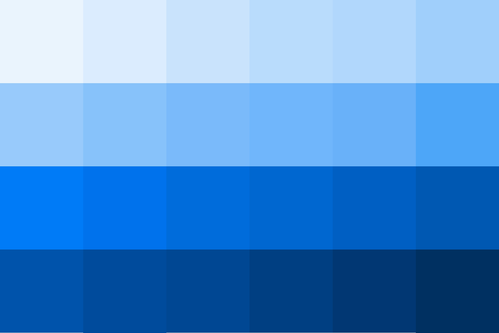
Blue is a chromatic color, composed of hundreds of shades between green and violet.
Although blue is considered a cool color (as opposed to a warm red), shades of blue can be warmer or cooler depending on their undertones. The undertones are the secondary colors that are mixed with your blue: a little green will give you a peacock blue or teal, for example.
In addition, saturation also plays an important role: from a dull hue (blue-gray) to a vibrant hue (electric blue).
Finally, brightness will also determine your shade of blue: from a deep, dark shade like midnight blue, to a light shade like sky blue.
So, if you used to say that blue was your favorite color, you can now be more precise! As we have just seen, the range of blue is very wide. You probably have a preference between navy blue, pastel blue and electric blue!
💡TIP: The choice is yours! Be creative when choosing a shade of blue, don’t use a shade that is too close to your competitors’.
Blue and civilizations: history and perceptions
Now that we have defined the color blue, let’s begin to answer our question about the ubiquity of this color in graphic design by focusing on its history and its relationship to past and present civilizations.
A short history of the color blue
The birth of “blue”
This may surprise you, but blue was only born in the Middle Ages. Before that, neither its name nor its concept had been defined. In other words, blue was not a notion that existed at that time for human beings. However, this does not mean that there were no blue objects, just that blue was not considered a color in its own right. Anything blue was described with the colors that existed at the time. It’s very difficult to conceive of in this day and age!
A history of pigments
Blue is rarely found in nature, and natural blue pigments are therefore scarce. As a matter of fact, the only natural blue pigments come from indigo (a plant), pastel (a plant) and lapis lazuli (a mineral).
Civilizations quickly learned how to create synthetic blue pigments. The first of these was invented by the Egyptians in ancient times, called Egyptian blue. Prussian blue, Cobalt blue and Phthalocyanine blue are some other examples of synthetic blue pigments.
It is interesting to note that although blue did not yet have a name, human beings already seemed to be fascinated by this color to the point of trying to create pigments.
Blue and perceptions
Past perceptions
Today, blue is a color that is part of our daily lives, but this was not always the case. In ancient Rome, blue was despised: it was a symbol of ridicule and even associated with barbarians.
From the Middle Ages, the color took on a divine connotation and it started to appear on many religious works of art. It then became the color of the monarchy (of divine rights) a little later.
Finally, in the 20th century, all of humanity embraced the color blue when blue jeans came into fashion.
Current perceptions
As we have seen, depending on the era or culture, the feelings and connotations associated with certain colors can vary. Let’s take a look at current perceptions around the color blue.
In English, we say “feeling blue” to describe feelings of depression, but when we have “blue skies ahead” it means that we are optimistic about the future. In French, “être fleur bleue” means to be romantic or sentimental, and “avoir une peur bleue” means scared to death! So, blue can evoke several disparate images depending on the language.
Here are a few examples of different perceptions associated with the color blue:
Current universal perceptions
confidence
security
eternity
calm
peace
freedom
nostalgia
Specific cultural perceptions
nobility, royalty: royal blue, to have “blue blood”
workers: “blue collar” laborers, as opposed to “white collar” office workers
💡TIP: Although the feelings commonly associated with the color blue are calm and confidence, it is always a good idea to check the perception of each hue you plan to use in your communications against your target audience and their culture.
Blue in art
We couldn’t talk about blue in graphic design without also mentioning blue in art. Of course, graphic design draws inspiration from art! We can find blue in many works of art: from Van Gogh’s Starry Night to Hokusai’s The Great Wave to Andy Warhol’s Colored Mona Lisa.
So, while we will only cite a few interesting examples of the use of blue in art below, there are certainly many others.
The Jardin Majorelle
Have you heard of this villa and garden in Morocco, painted entirely in a special cobalt blue shade? It has become a very famous destination because it is so unique.
French painter Jacques Majorelle was inspired by Marrakesh and built a villa with its own botanical garden in the 1930s. But he did not stop there, he also created the “Majorelle blue” color and decided to paint the walls of his villa with it.
This garden has become a huge source of inspiration for artists and creatives, notably for French fashion designer Yves Saint-Laurent.
💡 REMEMBER: Use blue in bold, new, unexpected, and inspiring ways.
Yves Klein: IKB blue
Let’s focus now on another inventor of blue: Yves Klein. He is the creator of IKB blue, or International Klein Blue, a shade close to ultramarine blue. He is a visual artist who used his invention, the IKB, in many works, including monochrome, meaning using only this color.
💡 REMEMBER: You can use blue as a trademark, a unique blue that makes you recognizable.
Picasso: the Blue Period
Our final example of the use of blue in art is Picasso’s Blue Period from 1901 to 1904. Deeply affected by the death of a loved one, the young painter began to paint in shades of blue to express his grief.
💡 REMEMBER: Colors can relay messages and express feelings.
Blue in graphic design and brand visual identity
After our extensive theoretical overview on the color blue, which we hope will have convinced you of its importance, let’s move on to a practical study: how do brands use blue? Plus, how to use it well in your brand identity and, by extension, in your digital publications on Calaméo.
Because blue is humankind’s favorite color, it seems obvious that using it in your designs is a good idea since it will appeal to a very large portion of your clients and prospects. In addition, there are many positive associations with this color: confidence, peace, calm. People will associate your brand with these qualities instantly.
So, just by using blue in your brand style guide, the public will have a positive perception of your brand.
For the user experience
In graphic design, it’s important to focus on the user experience and make it as pleasant as possible for everyone. Blue being the color least affected by color vision disorders, it is a good choice for your graphic design.
Examples of blue in brand style guides
To help you use blue in your visual identity and in your communications, here are some interesting examples of the use of blue in brand style guides and good ideas to inspire your creativity.
Ikea: unmistakable
How can we talk about blue in graphic design without talking about Ikea? Ikea uses two strong colors that stand out and give a unique and recognizable visual identity. It’s probably the only furniture store that you are able to recognize from afar, wherever you are in the world, thanks to its blue and yellow sign and blue exterior.
💡 REMEMBER: Partner two strong colors that contrast, such as complementary colors, for a big impact. For example: combine blue with orange or yellow tones.
These distinctive colors reflect those of the Swedish flag. This choice reinforces Ikea’s brand identity: from the names of the products to the types of dishes offered in their restaurants to their brand style guide…all of these elements emphasize the company’s origins.
💡REMEMBER: Use specific colors to reinforce your brand identity.
Major players on the web: all in shades of blue
Among the major Internet companies, almost all of their logos are blue. You can see some examples above. What at the beginning was perhaps a strategic choice seems to have turned into a trend. We can imagine that the choice of a blue logo of the first entities on the Internet reflects the desire to have an image of stability and confidence in this new virtual world that seemed ephemeral. As a result, blue logos are now associated with tech and web companies.
💡REMEMBER: Study your competitors and their brand style guides; if they all use the same codes, there may be a reason.
Calaméo: blue for emphasis
Finally, we wanted to tell you about our use of blue. Although blue is not our main color and does not appear in our logo, we do have a very specific use for it. We use blue to highlight and emphasize important messages. As you can see, on our blog the links are in blue and stand out.
💡REMEMBER: You can use a shade of blue in your graphic design without it being a main color. Do not hesitate to give it a specific function.
In this respect, many brands use blue in their visual identity, and the color performs different functions for each. From main color to accent color, it is a matter of finding the best way to incorporate this color in your style guide so that it completes your brand and identity.
Blue is a fascinating color: its history, its many uses in art, and all its different meanings and connotations. That’s why blue has become an essential color in graphic design.
Don’t hesitate to use it in your brand identity and in your digital publications. Blue used with ingenuity, in an original shade or in combination with unusual shades, will make you stand out and will make your content unforgettable.