“Flipbook” has become a go-to word whenever people talk about digital publishing, online magazines, or interactive publications. More and more brands, institutions, schools, and media organizations want to move beyond static PDFs and offer a smoother, more modern, more engaging reading experience.
This article breaks down what a flipbook is, how it’s different from a traditional PDF, why it’s become a key format in digital publishing, and where it fits best in your content strategy.
- What is a flipbook?
- Why flipbooks are becoming a must in digital publishing
- The main benefits of flipbooks
- Use cases: when does a flipbook make sense?
- Flipbooks as part of your digital publishing strategy
- Why choose Calaméo for your flipbooks?
What is a flipbook?
From static document to interactive experience
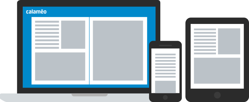
A flipbook is a digital version of your document that feels like reading a printed publication: you turn pages, the layout is preserved, navigation is smooth, and reading in full screen is natural. Instead of opening in a basic PDF viewer, the flipbook loads in an online reader directly in the browser — no download, no plugin.
It’s not just about the page-turn animation. A flipbook is built for screens: it’s hosted online, can be enriched with links and media, and plugs neatly into your digital publishing stack.
Flipbook vs PDF: what really changes
A standard PDF is typically:
- Downloaded and opened in a separate app
- Frustrating to read on a phone
- Almost impossible to track or make interactive
A flipbook is:
- Available through a simple URL
- Displayed in an immersive, responsive reader
- Ready for interactivity (links, media, CTAs, navigation)
You don’t have to get rid of PDFs entirely. The idea is to offer a better way to read the same content online — a format built for the web instead of just “uploaded as is”.
Why flipbooks are becoming a must in digital publishing
A much better reading experience
The first big win with flipbooks is comfort:
- Readers flip pages like in a real magazine
- The original layout and design are preserved
- Full screen makes it easy to focus
- On mobile, you swipe instead of constantly zooming and scrolling
Instead of fighting with a PDF on a smartphone, readers get a digital publication that actually feels made for their screen.
From “sending a file” to actually publishing content
Once you turn a PDF into a flipbook on a digital publishing platform, you completely change how that document lives:
- It has its own URL
- It can be embedded on your website
- You can see how it’s used through analytics
The flipbook stops being “the file attached to an email” and becomes a content asset that plays a real role in your digital strategy.
The main benefits of flipbooks
Stronger visual impact
A flipbook respects your original design: typography, images, grid, and composition. That matters for:
- Brands with strong visual identities
- Publishers and media with editorial layouts
- Organizations that produce reports, catalogs, and brochures
Rather than flattening everything into a generic PDF viewer, the flipbook puts your content in an immersive reader that feels premium and intentional.
Higher engagement with interactive features
A flipbook isn’t just a nicer way to scroll through pages. It can become a true interactive publication:
- Internal links to jump between sections
- External links to product pages, forms, videos, or landing pages
- Clear CTAs to sign up, book a meeting, download something, or request a demo.
Your document stops being just “something people read” and starts acting like a touchpoint that generates clicks, leads, and revenue.
Easier to access, easier to share
Because flipbooks live online, they are:
- Shared with a simple link
- Embedded on websites and blogs
- Available anytime, on any device
No more huge attachments or “can you resend me that file?”. Your teams, customers, students, or partners always access the latest version in the same place.
Analytics that show how people actually read
A PDF gives you almost no signal about how it’s used. A flipbook, depending on the platform, can tell you:
- How many times it’s been viewed
- How long people read it
- Which pages get the most attention
- Which links are clicked
- Which devices people use
- Where your readers are coming from
These insights are gold when you want to improve your digital publications and justify the impact of your content.
Use cases: when does a flipbook make sense?
Online magazines and digital newspapers
Flipbooks are a natural fit for online magazines and editorial content. They let you:
- Keep the look and feel of a print magazine
- Add links to related articles, videos, or bonus content
- Send readers to your website, partners, or advertisers
For publishers, it’s a straightforward way to extend print into digital or launch fully digital titles without losing the editorial experience.
Product catalogs and lookbooks
For brands and retailers, flipbooks shine in:
- Seasonal catalogs
- Lookbooks and collection drops
- B2B catalogs and wholesale price lists
Each product visual or description can link directly to a product page, a contact form, or even a shopping cart. Your catalog becomes a sales tool, not just a static PDF to browse.
Sales brochures and corporate materials
Sales and marketing teams can use flipbooks for:
- Company overviews
- Offer and service brochures
- Case studies and customer stories
Instead of sending a PDF attachment, they share a hosted digital brochure that opens instantly and includes clear next steps: contact us, book a demo, view pricing, download a spec sheet, etc.
Annual reports, ESG reports, and white papers
High-value corporate content such as:
- Annual reports
- ESG and sustainability reports
- White papers and research publications,
benefits a lot from a flipbook format. The document is easier to read, easier to share with stakeholders, and you can actually see how it’s consulted.
Learning content and internal documentation
Schools, training centers, and companies can also use flipbooks for:
- Training guides and course outlines
- Program brochures
- Internal manuals and process documents
Learners and employees get a structured, screen-friendly format that you can update without resending files all the time.
Flipbooks as part of your digital publishing strategy
Moving from “sending PDFs” to a real publishing approach
Using flipbooks is part of a broader shift: you’re no longer just “sending documents”, you’re building a real digital publishing strategy. In practice:
- Your publications live on a dedicated platform
- They’re organized, searchable, and reusable
- They have an audience and measurable performance
A flipbook isn’t just a file that travels around. It’s published content with a URL, analytics, and a role to play in your overall communication.
Plugging flipbooks into your content ecosystem
Flipbooks fit naturally into the rest of your content:
- Embedded on your website and landing pages
- Linked in newsletters and email campaigns
- Accessed via QR codes on print materials
- Shared by sales reps and customer support
They sit alongside blog posts, videos, webinars, and social content as one more format in your content marketing mix.
Why choose Calaméo for your flipbooks?
A platform built for interactive digital publications
Calaméo is a digital publishing platform designed specifically to turn PDFs into interactive flipbooks and professional online publications. It’s used by brands, agencies, institutions, and media that need more than a simple PDF viewer.
With Calaméo, you can publish:
- Online magazines and newsletters
- Product catalogs and lookbooks
- Sales brochures and corporate collateral
- Annual reports, ESG reports, and white papers
- Educational resources and internal documentation
All in an environment built for organization, privacy, and collaboration.
An immersive, on-brand reading experience
Calaméo’s immersive reader showcases your layouts and visuals. On paid plans, you can:
- Remove third-party ads
- Match the viewer to your brand look and feel
- Deliver a reading experience that feels professional and consistent.
That’s key for online magazines, institutional reports, and brand catalogs where perception, not just content, really matters.
Analytics to steer your digital publishing efforts
With Calaméo, every flipbook comes with detailed analytics. You can see:
- How many people read it
- How long they stay
- Which pages they care about most
- How they interact with your links.
These insights help you understand how your audience consumes your digital publications, iterate on your content, and strengthen your overall digital publishing strategy.
 Try all our features today by starting your free 14-day trial of Calaméo PLATINUM.