Do you know the term “dark social”? Although a lot has changed about social media since the idea was first described in 2012, dark social sharing is as important as ever. In fact, this type of sharing might be even more key to understanding your content’s success today. Read on to learn why dark social matters in 2021 and how to track it for your digital publications on Calaméo.
Dark social sharing basics
All the way back in 2012, people were beginning to wonder how much content was being shared to social media networks. Or how much content was being shared in other ways. Because networks like Facebook and Twitter were growing fast, share buttons popped up all around the web to make reposting to your own feed easy—and trackable.
But while the number of shares ticked up, this new behavior couldn’t be the only way users were passing along videos, publications and posts. Despite the buzz around social feeds, research showed that plenty of people were sharing in a simple way: copying and pasting the content’s URL into email and messages. Unlike regular social shares, this kind of social activity wasn’t tracked.
As a result, it was easy to miss dark social sharing’s value. However, over the past several years sharing to social media platforms has declined. There are several reasons to explain this trend, including algorithm changes, rising interest in digital privacy and concerns about how information spreads online. Since more than a third of businesses say that “social shares” are a goal for their content, these harder-to-see forms of social sharing must be taken into account.
💡 TIP: Not sure whether social shares are a priority for your publications? Our quick checklist will help you brush up on your digital publishing strategy in no time.
How to track shares on Calaméo
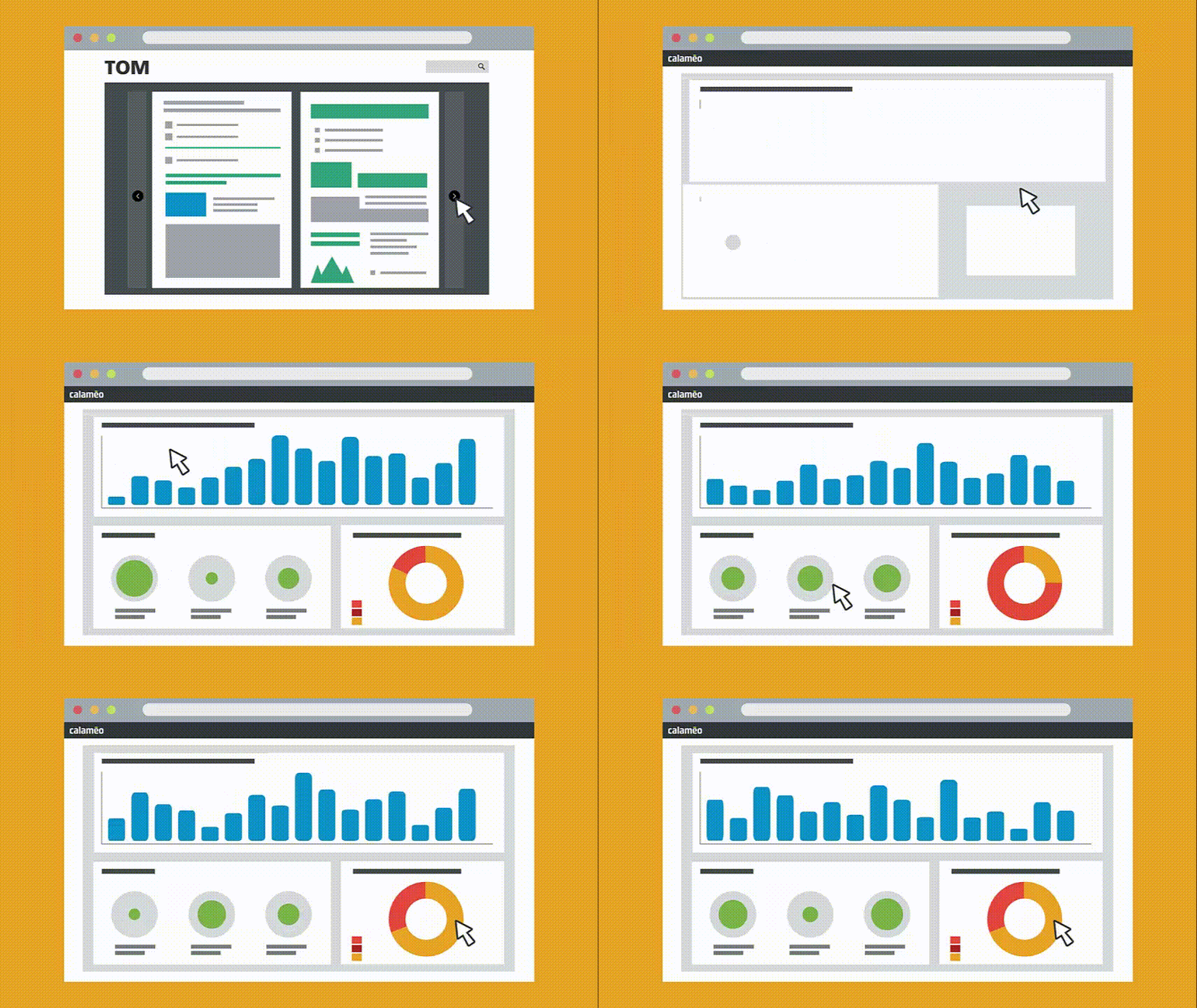
So, how should you track the “dark social” sharing of your content? When it comes to your digital publications, Calaméo’s advanced statistics are a great place to start. That’s because our publication viewer’s own share button was designed with lots of different uses in mind. Take a closer look and you’ll see some options beyond the usual social networks.
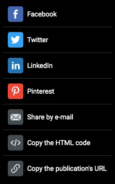
Even better, the Shares section of your Calaméo statistics will show you just how many times your publication was emailed, embedded or its URL copied. And the results might surprise you. For example, we were checking the stats for our most recent issue of CALAMEO Magazine and noticed this breakdown:
30% shares to social media platforms
70% “dark social” shares to email, embed or copying URL
To access your publications’ Shares data, go to the Statistics section of your Calaméo account. Click on the “Shares” tab and scroll down to find the full statistics.
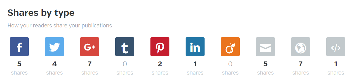
Also, be sure to note that these numbers only reflect “dark social” shares coming from inside the publication viewer. You can almost certainly be sure that other readers have, for instance, copied and pasted the publication URL directly from their browsers to share with their networks. Or to put it another way, public social shares may only be telling you a small part of the story.
💡 TIP: To keep digging deeper into the impact of dark social sharing for your content, consider using tracked links and Google Analytics to reveal more data.
In short, social media metrics don’t give you the whole picture when you want to measure how your content is shared online. If you’d like to start looking at complete Shares statistics for your publications on Calaméo, request your free, two-week PLATINUM demo today.

You can’t have missed it: in graphic design, the color blue is everywhere. It’s even the most popular color for logos! So, from turquoise to sapphire, cobalt to azure, let’s investigate why blue is so ubiquitous.
Here is a quick summary of the themes that we will cover in this article:
Let’s start with an accurate definition of the color blue.
Blue: a simple primary color?
As we learned early on at school: blue is a primary color. However, it’s not quite that simple. In the additive color model (or RGB for Red, Green, Blue), which is used to define the colors diffused on our screens on websites and digital communications, blue is indeed a primary color. Yet for printed materials, the primary blue shade used is actually a cyan tint (blue-green). The printing industry uses the subtractive color model, or CMYK for Cyan, Magenta, Yellow, Black.
The many hues of blue
Blue is a chromatic color, composed of hundreds of shades between green and violet.
Although blue is considered a cool color (as opposed to a warm red), shades of blue can be warmer or cooler depending on their undertones. The undertones are the secondary colors that are mixed with your blue: a little green will give you a peacock blue or teal, for example.
In addition, saturation also plays an important role: from a dull hue (blue-gray) to a vibrant hue (electric blue).
Finally, brightness will also determine your shade of blue: from a deep, dark shade like midnight blue, to a light shade like sky blue.
So, if you used to say that blue was your favorite color, you can now be more precise! As we have just seen, the range of blue is very wide. You probably have a preference between navy blue, pastel blue and electric blue!
💡TIP: The choice is yours! Be creative when choosing a shade of blue, don’t use a shade that is too close to your competitors’.
Blue and civilizations: history and perceptions
Now that we have defined the color blue, let’s begin to answer our question about the ubiquity of this color in graphic design by focusing on its history and its relationship to past and present civilizations.
A short history of the color blue
The birth of “blue”
This may surprise you, but blue was only born in the Middle Ages. Before that, neither its name nor its concept had been defined. In other words, blue was not a notion that existed at that time for human beings. However, this does not mean that there were no blue objects, just that blue was not considered a color in its own right. Anything blue was described with the colors that existed at the time. It’s very difficult to conceive of in this day and age!
A history of pigments
Blue is rarely found in nature, and natural blue pigments are therefore scarce. As a matter of fact, the only natural blue pigments come from indigo (a plant), pastel (a plant) and lapis lazuli (a mineral).
Civilizations quickly learned how to create synthetic blue pigments. The first of these was invented by the Egyptians in ancient times, called Egyptian blue. Prussian blue, Cobalt blue and Phthalocyanine blue are some other examples of synthetic blue pigments.
It is interesting to note that although blue did not yet have a name, human beings already seemed to be fascinated by this color to the point of trying to create pigments.
Blue and perceptions
Past perceptions
Today, blue is a color that is part of our daily lives, but this was not always the case. In ancient Rome, blue was despised: it was a symbol of ridicule and even associated with barbarians.
From the Middle Ages, the color took on a divine connotation and it started to appear on many religious works of art. It then became the color of the monarchy (of divine rights) a little later.
Finally, in the 20th century, all of humanity embraced the color blue when blue jeans came into fashion.
Current perceptions
As we have seen, depending on the era or culture, the feelings and connotations associated with certain colors can vary. Let’s take a look at current perceptions around the color blue.
In English, we say “feeling blue” to describe feelings of depression, but when we have “blue skies ahead” it means that we are optimistic about the future. In French, “être fleur bleue” means to be romantic or sentimental, and “avoir une peur bleue” means scared to death! So, blue can evoke several disparate images depending on the language.
Here are a few examples of different perceptions associated with the color blue:
Current universal perceptions
confidence
security
eternity
calm
peace
freedom
nostalgia
Specific cultural perceptions
nobility, royalty: royal blue, to have “blue blood”
workers: “blue collar” laborers, as opposed to “white collar” office workers
💡TIP: Although the feelings commonly associated with the color blue are calm and confidence, it is always a good idea to check the perception of each hue you plan to use in your communications against your target audience and their culture.
Blue in art
We couldn’t talk about blue in graphic design without also mentioning blue in art. Of course, graphic design draws inspiration from art! We can find blue in many works of art: from Van Gogh’s Starry Night to Hokusai’s The Great Wave to Andy Warhol’s Colored Mona Lisa.
So, while we will only cite a few interesting examples of the use of blue in art below, there are certainly many others.
The Jardin Majorelle
Have you heard of this villa and garden in Morocco, painted entirely in a special cobalt blue shade? It has become a very famous destination because it is so unique.
French painter Jacques Majorelle was inspired by Marrakesh and built a villa with its own botanical garden in the 1930s. But he did not stop there, he also created the “Majorelle blue” color and decided to paint the walls of his villa with it.
This garden has become a huge source of inspiration for artists and creatives, notably for French fashion designer Yves Saint-Laurent.
💡 REMEMBER: Use blue in bold, new, unexpected, and inspiring ways.
Yves Klein: IKB blue
Let’s focus now on another inventor of blue: Yves Klein. He is the creator of IKB blue, or International Klein Blue, a shade close to ultramarine blue. He is a visual artist who used his invention, the IKB, in many works, including monochrome, meaning using only this color.
💡 REMEMBER: You can use blue as a trademark, a unique blue that makes you recognizable.
Picasso: the Blue Period
Our final example of the use of blue in art is Picasso’s Blue Period from 1901 to 1904. Deeply affected by the death of a loved one, the young painter began to paint in shades of blue to express his grief.
💡 REMEMBER: Colors can relay messages and express feelings.
Blue in graphic design and brand visual identity
After our extensive theoretical overview on the color blue, which we hope will have convinced you of its importance, let’s move on to a practical study: how do brands use blue? Plus, how to use it well in your brand identity and, by extension, in your digital publications on Calaméo.
Because blue is humankind’s favorite color, it seems obvious that using it in your designs is a good idea since it will appeal to a very large portion of your clients and prospects. In addition, there are many positive associations with this color: confidence, peace, calm. People will associate your brand with these qualities instantly.
So, just by using blue in your brand style guide, the public will have a positive perception of your brand.
For the user experience
In graphic design, it’s important to focus on the user experience and make it as pleasant as possible for everyone. Blue being the color least affected by color vision disorders, it is a good choice for your graphic design.
Examples of blue in brand style guides
To help you use blue in your visual identity and in your communications, here are some interesting examples of the use of blue in brand style guides and good ideas to inspire your creativity.
Ikea: unmistakable
How can we talk about blue in graphic design without talking about Ikea? Ikea uses two strong colors that stand out and give a unique and recognizable visual identity. It’s probably the only furniture store that you are able to recognize from afar, wherever you are in the world, thanks to its blue and yellow sign and blue exterior.
💡 REMEMBER: Partner two strong colors that contrast, such as complementary colors, for a big impact. For example: combine blue with orange or yellow tones.
These distinctive colors reflect those of the Swedish flag. This choice reinforces Ikea’s brand identity: from the names of the products to the types of dishes offered in their restaurants to their brand style guide…all of these elements emphasize the company’s origins.
💡REMEMBER: Use specific colors to reinforce your brand identity.
Major players on the web: all in shades of blue
Among the major Internet companies, almost all of their logos are blue. You can see some examples above. What at the beginning was perhaps a strategic choice seems to have turned into a trend. We can imagine that the choice of a blue logo of the first entities on the Internet reflects the desire to have an image of stability and confidence in this new virtual world that seemed ephemeral. As a result, blue logos are now associated with tech and web companies.
💡REMEMBER: Study your competitors and their brand style guides; if they all use the same codes, there may be a reason.
Calaméo: blue for emphasis
Finally, we wanted to tell you about our use of blue. Although blue is not our main color and does not appear in our logo, we do have a very specific use for it. We use blue to highlight and emphasize important messages. As you can see, on our blog the links are in blue and stand out.
💡REMEMBER: You can use a shade of blue in your graphic design without it being a main color. Do not hesitate to give it a specific function.
In this respect, many brands use blue in their visual identity, and the color performs different functions for each. From main color to accent color, it is a matter of finding the best way to incorporate this color in your style guide so that it completes your brand and identity.
Blue is a fascinating color: its history, its many uses in art, and all its different meanings and connotations. That’s why blue has become an essential color in graphic design.
Don’t hesitate to use it in your brand identity and in your digital publications. Blue used with ingenuity, in an original shade or in combination with unusual shades, will make you stand out and will make your content unforgettable.
Before spring 2020, lots of people wondered what going to work would look like in the future. Would workers jump into hover cars and fly to their jobs every day, Jetsons-style? Would automation make it possible to work for just a few hours a week? Would new online technologies mean more and more people choosing to work from home?
Then, the COVID-19 pandemic struck across the world. With populations from Melbourne to Mexico City on lockdown, millions of people found their ways of working transformed overnight. Offices, shops, restaurants and schools closed their doors. For many, work needed to be done from home; for others, work needed to adapt to new, fast-evolving conditions.
Although most lockdowns have ended, the huge changes to the way we work did not disappear. Instead, work continues to change—month to month, week to week and even day by day. As governments, businesses and individual people adjust to COVID-19, the future of work has never looked so uncertain. Or so close. Read on for the key takeaways about what may be coming next.
Going online
In the mid-1970s, a big, buzzy idea about the future of work emerged called the paperless office. At the time, an office without paper would have sounded ridiculous. For example, the typical office relied on paper memos, reports, forms, orders, invoices, bills, receipts and correspondence. Add in photocopies and that’s quite a mountain of paperwork! But personal computers were just beginning to arrive in business settings and over the next decades, electronic files, documents and mail followed.
The long shift toward a paperless office went into overdrive in 2020 as workers went into lockdown. Suddenly, the office needed to be not only paperless, but also entirely online. And though the concept of remote work has become more accepted in recent years, few businesses were completely prepared for it. As a result, the demand for new solutions has exploded. Videoconferencing, digital publishing and remote management tools help recreate the office online so that employees can log on, stay connected and work safely from home.
Despite an often abrupt move to the online office, remote work seems likely to extend into 2021 and beyond. In the United States alone, almost half of all workers were still doing some of their job at home by the end of the summer; one in four were fully remote. Recent surveys suggest that over 90% of office workers don’t expect to go back to their desks full time. Plus, the online office has offered unexpected benefits beyond safety and flexibility. With no commutes, people have saved billions of hours of time and decreased pollution.
Communicating change
However, offices aren’t the only workplaces that have undergone dramatic changes in 2020. Half of the workforce leaves home to do their jobs, a figure that includes the category of essential workers. From doctors and nurses to farmers and grocery staff, most people have had little to no options for working from home. In order to protect workers on-site, all types of employers needed to react fast. New policies boosted sanitation standards, limited capacity, encouraged social distancing and required masks.
And throughout the year, businesses have often had to modify those policies as the pandemic progressed. Due to the evolving situation, clear communicationhas become more important than ever. First, employers must keep workers informed about protective measures and rules to ensure everyone’s safety. Next, businesses must let customers know what actions they are taking and what to expect in store. Email, online employee handbooks and digital customer guides are essential ways to communicate this information quickly and clearly.
In fact, lockdowns and limited capacity led to more use of online tools in “offline” fields like hospitality. While the Internet is already big business, there’s room to grow. For instance, restaurants unable to welcome customers published take-out menus on the Internet and stores focused on improving ecommerce channels. On the other hand, some traditionally in-person activites went totally virtual. Museums, conferences and events took advantage of video and interactive media to create new kinds of experiences online.
Finding balance
Amid the pandemic, workers have been confronted with lots of new experiences—and not all are as fun as a virtual dance party. Some must cope with strict and at times challenging safety protocols. Others have been isolated by working from home alone for months. In almost every situation, workers face the danger of burnout. The pressure of such major changes to daily life can cause stress, anxiety and depression. Looking ahead, balancing new habits with long-term needs will be key to the future of work.
Now, people are reviewing how work will fit into their living spaces and their lifestyles. In many places, workers are moving away from cities to find more nature and bigger homes. They’re planting windowsill gardens, setting up home offices and creating community services with colleagues and neighbors. It’s too early to tell which trends have staying power and which will fade with time. But no matter what happens to the water cooler, one smart bet is on the importance of staying connected.
That’s because everyone agrees that relationships matter at work. People will always need to know their coworkers, understand the culture of their organization and meet with their managers. In 2020, workers have tested out an unprecedented range of solutions for getting their jobs done in difficult circumstances. As businesses begin to make choices about thepath forward, they also need to consider the best ways to keep workers engaged, in touch and focused on the future.
In conclusion, you might need a crystal ball to know exactly who will still be working remotely six months from now or where masks will be required. However, you can be sure that work is changing. More flexible, more transparent and more digital work is likely to be a lasting legacy of the COVID-19 pandemic. And as for flying cars? Maybe in 2040—or sooner than you think.
Read this article in our 6th issue of Calaméo Magazine, as well as many others on the theme of work: