One of the biggest benefits of digital publishing is the direct contact any business can establish with its clients. Whether you distribute a product catalog, magazine, flyer or report online with Calaméo, you can reach your customers, prospects and a global readership all at once!
In this article, we’ll explain smart strategies for using digital publishing to connect with local, national and international audiences.
Make a local impact
As more and more people turn to the Internet for local information, creating a strong online presence for your business is essential. Publishing your documents digitally on Calaméo is a fast and simple way of making the information available to your community on the web. Plus, your publications will benefit from our high PageRank for improved visibility in search results.
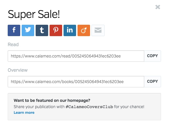
Having a special event or in-store sale? When you publish your flyers and posters on Calaméo, they’re instantly shareable. Post them to your social media accounts and community groups to let your neighbors, followers and customers know what’s on!
Reach clients online
Catalogs and reports are valuable sales and marketing tools, but they can be challenging to use effectively. Printing and distribution are often costly while simply uploading a PDF version to your website fails to provide an optimal user experience.
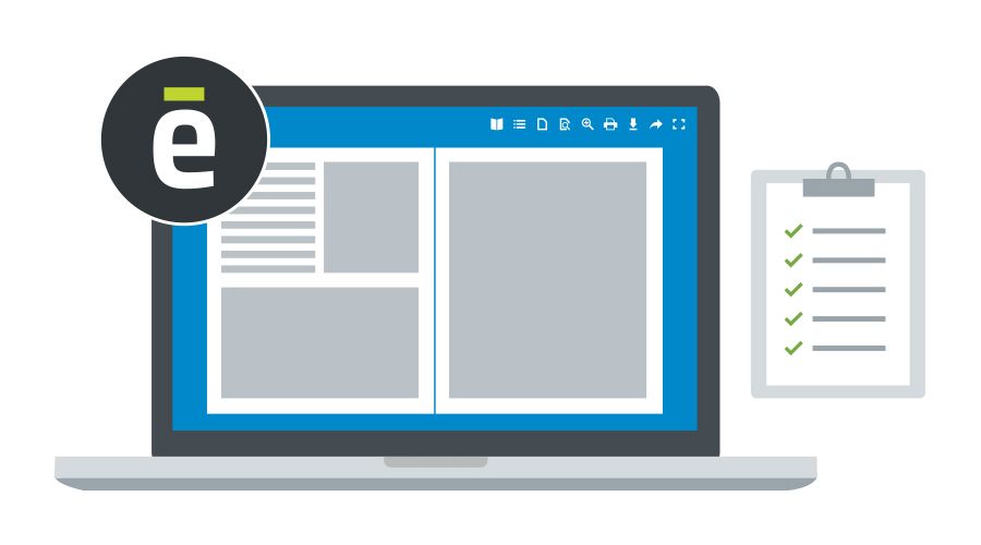
Transforming your business’s catalog into a digital publication takes just a few seconds with Calaméo’s powerful technology. Then, you can enrich it with external links to help readers shop your products. This example from Éditions Retz takes advantage of link labels to include strong calls to action:
Embed your finished digital publication in your business’s site for your clients to browse and for future clients to discover!
Target global users
Although you may already be thinking of local and national audiences for your business, publishing digitally also offers international exposure. For example, Gruppo Food’s Italian Taste Journey series introduces food lovers everywhere to the specialties of different Italian regions.
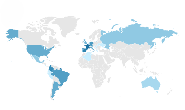
Our advanced statistics show where your readers are located globally, so you can identify which places around the world are interested in your publications. If the results surprise you, it could be an opportunity for growth! You might consider tailoring your content to this international audience, or adjust your advertising.
💡 TIP: BASIC and PREMIUM accounts can see their readership’s top three countries, while PLATINUM accounts can dig into the full list!
With these tips for communicating with different types of audiences, you’ll be well-equipped to get the most value out of digital publishing for your business.
Interested in testing the full range of readership statistics on Calaméo? Our no-commitment PLATINUM Demo is free for 14 days. Let us know if you’d like to try it!
Thanks to social media, delivering content to thousands of people at once is as easy as hitting the “Post” button. But it isn’t always easy to achieve the results you have in mind. That’s why we’re bringing you a new series all about making these channels work for your digital publishing needs. Next up: how to promote content with LinkedIn.
Why use LinkedIn to promote content?
If you think of LinkedIn mostly as a place to look for job openings, think again. Over the past several years, the social network built for professionals has added lots of new features and tools designed for content. Although it’s not the biggest social platform, LinkedIn’s 810 million users represent a particularly valuable audience of executives, entrepreneurs and employees.
As a result, LinkedIn has become a key channel for distributing B2B digital content. In other words, businesses that sell their products or services to other businesses want to be seen in LinkedIn Feeds. In fact, it’s the #1 social media network for B2B marketers with a content strategy. A recent study found that 95% said they published non-sponsored posts on LinkedIn. (More focused on B2C? Keep reading—B2C marketers use the platform, too.)
Since 30 million companies have joined LinkedIn, the importance of B2B influencers has exploded. Also called “thought leaders,” these users can attract big audiences to their reflections on trends, tools and ideas in business. Consider how your digital publications, from brochures to white papers, can help your company join the conversation and reach the right readers. Then, get ready to promote content with LinkedIn.
Choose the right format
The first choice you’ll need to make when posting your content to LinkedIn is what format to use. Because LinkedIn offers different options than most other social platforms, this can be a little more complicated than usual. For example, personal profiles and business pages don’t have the same posting possibilities.
If you’re posting from a business page to promote content with LinkedIn, you’ll have three main choices. You can create a classic Link post, an Image post or a Document post.
Link post
A Link post is great for sharing important sales and lead generation content, like your professional digital publications on Calaméo. Whether embedded on a landing page or ready to browse in our full-screen viewer, your publications can benefit from readers coming from LinkedIn.
Image post
An Image post will contain a featured .jpg or .png file, plus your message. To achieve an Image look while still including a link in your update, first enter the post text and link. Then, LinkedIn will pull a selection of images from your link to use in your post. Choose the image you prefer and hit Post!
Document post
A Document post allows you to publish an entire PDF file within a LinkedIn update. Readers will be able to view your document without ever leaving their feeds, which means you can share more complex content directly in the Feed.
If you’re posting from a personal profile, you also have access to LinkedIn’s Articles feature. The Articles format is similar to a blog post: longer than the messages that accompany Link, Image and Document posts, but more limited in scope than a digital publication.
In short, the post format that works best for you will depend on why you want to promote content with LinkedIn. For instance, Articles and Image posts might help you find new followers and build an audience on the platform. However, Link posts to your digital publications may be most effective for nurturing prospects and gaining customers.
Optimize your message
In addition to its professional user base, marketers love LinkedIn for its generally high engagement rates for organic posts. You should expect to see 1-2% of the people who see your update to comment, click, react or share. Meanwhile, engagement rates on Facebook and Twitter are only about half of that: 0.50% to 1%.
What’s more, LinkedIn has been open about the factors that make a post likely to get better reach. Above all, engagement matters. Getting your followers—and their followers!—to respond to your posts is the key factor to effectively promote content with LinkedIn.
So what can you do in concrete terms to encourage engagement? There are lots of ideas out there, but the most common advice is to focus on your post text. For every type of post format, you’ll be able to include a message of up to 700 characters. Use that space to speak to your audience! Explain why they should click, ask what they think, tell them a story about your content. To finish, add a few well-chosen hashtags to make your post easier to discover.
Watch for conversions
Once you’ve started sharing on LinkedIn, you can begin to evaluate the kinds of content that you’d most like to emphasize. For many B2B oriented companies, online content marketing with guides, case studies, white papers and more has become an important way to find new customers. And you’ll want to know how well these digital publications are performing.
LinkedIn provides a number of useful statistics about your updates, which are visible to company Page Administrators in their Analytics tab. Besides gaining valuable insights into your audience, you can check the reach, clicks and overall engagement rate of your posts. Unfortunately, there are no more specific details available about the digital publications that you’ve shared. In other words, even Document posts won’t have data about publication views.
Therefore, you can get the best out of both worlds when you promote content with LinkedIn that is part of your sales and marketing strategy. Create a post about a digital publication embedded on your website, where a pop-up form can generate leads. Or enrich your business’s catalogue with Shopping links, then share to support sales. Your digital publications on Calaméo come with advanced statistics that help you dig deeper into audience engagement.
Ready to start?
Now that you’ve got all the details about how to promote content with LinkedIn, it’s time to turn your online documents into great digital publications. Sign up for your free Calaméo account today and explore what digital publishing can do for you!
You can’t have missed it: in graphic design, the color blue is everywhere. It’s even the most popular color for logos! So, from turquoise to sapphire, cobalt to azure, let’s investigate why blue is so ubiquitous.
Here is a quick summary of the themes that we will cover in this article:
Let’s start with an accurate definition of the color blue.
Blue: a simple primary color?
As we learned early on at school: blue is a primary color. However, it’s not quite that simple. In the additive color model (or RGB for Red, Green, Blue), which is used to define the colors diffused on our screens on websites and digital communications, blue is indeed a primary color. Yet for printed materials, the primary blue shade used is actually a cyan tint (blue-green). The printing industry uses the subtractive color model, or CMYK for Cyan, Magenta, Yellow, Black.
The many hues of blue
Blue is a chromatic color, composed of hundreds of shades between green and violet.
Although blue is considered a cool color (as opposed to a warm red), shades of blue can be warmer or cooler depending on their undertones. The undertones are the secondary colors that are mixed with your blue: a little green will give you a peacock blue or teal, for example.
In addition, saturation also plays an important role: from a dull hue (blue-gray) to a vibrant hue (electric blue).
Finally, brightness will also determine your shade of blue: from a deep, dark shade like midnight blue, to a light shade like sky blue.
So, if you used to say that blue was your favorite color, you can now be more precise! As we have just seen, the range of blue is very wide. You probably have a preference between navy blue, pastel blue and electric blue!
💡TIP: The choice is yours! Be creative when choosing a shade of blue, don’t use a shade that is too close to your competitors’.
Blue and civilizations: history and perceptions
Now that we have defined the color blue, let’s begin to answer our question about the ubiquity of this color in graphic design by focusing on its history and its relationship to past and present civilizations.
A short history of the color blue
The birth of “blue”
This may surprise you, but blue was only born in the Middle Ages. Before that, neither its name nor its concept had been defined. In other words, blue was not a notion that existed at that time for human beings. However, this does not mean that there were no blue objects, just that blue was not considered a color in its own right. Anything blue was described with the colors that existed at the time. It’s very difficult to conceive of in this day and age!
A history of pigments
Blue is rarely found in nature, and natural blue pigments are therefore scarce. As a matter of fact, the only natural blue pigments come from indigo (a plant), pastel (a plant) and lapis lazuli (a mineral).
Civilizations quickly learned how to create synthetic blue pigments. The first of these was invented by the Egyptians in ancient times, called Egyptian blue. Prussian blue, Cobalt blue and Phthalocyanine blue are some other examples of synthetic blue pigments.
It is interesting to note that although blue did not yet have a name, human beings already seemed to be fascinated by this color to the point of trying to create pigments.
Blue and perceptions
Past perceptions
Today, blue is a color that is part of our daily lives, but this was not always the case. In ancient Rome, blue was despised: it was a symbol of ridicule and even associated with barbarians.
From the Middle Ages, the color took on a divine connotation and it started to appear on many religious works of art. It then became the color of the monarchy (of divine rights) a little later.
Finally, in the 20th century, all of humanity embraced the color blue when blue jeans came into fashion.
Current perceptions
As we have seen, depending on the era or culture, the feelings and connotations associated with certain colors can vary. Let’s take a look at current perceptions around the color blue.
In English, we say “feeling blue” to describe feelings of depression, but when we have “blue skies ahead” it means that we are optimistic about the future. In French, “être fleur bleue” means to be romantic or sentimental, and “avoir une peur bleue” means scared to death! So, blue can evoke several disparate images depending on the language.
Here are a few examples of different perceptions associated with the color blue:
Current universal perceptions
confidence
security
eternity
calm
peace
freedom
nostalgia
Specific cultural perceptions
nobility, royalty: royal blue, to have “blue blood”
workers: “blue collar” laborers, as opposed to “white collar” office workers
💡TIP: Although the feelings commonly associated with the color blue are calm and confidence, it is always a good idea to check the perception of each hue you plan to use in your communications against your target audience and their culture.
Blue in art
We couldn’t talk about blue in graphic design without also mentioning blue in art. Of course, graphic design draws inspiration from art! We can find blue in many works of art: from Van Gogh’s Starry Night to Hokusai’s The Great Wave to Andy Warhol’s Colored Mona Lisa.
So, while we will only cite a few interesting examples of the use of blue in art below, there are certainly many others.
The Jardin Majorelle
Have you heard of this villa and garden in Morocco, painted entirely in a special cobalt blue shade? It has become a very famous destination because it is so unique.
French painter Jacques Majorelle was inspired by Marrakesh and built a villa with its own botanical garden in the 1930s. But he did not stop there, he also created the “Majorelle blue” color and decided to paint the walls of his villa with it.
This garden has become a huge source of inspiration for artists and creatives, notably for French fashion designer Yves Saint-Laurent.
💡 REMEMBER: Use blue in bold, new, unexpected, and inspiring ways.
Yves Klein: IKB blue
Let’s focus now on another inventor of blue: Yves Klein. He is the creator of IKB blue, or International Klein Blue, a shade close to ultramarine blue. He is a visual artist who used his invention, the IKB, in many works, including monochrome, meaning using only this color.
💡 REMEMBER: You can use blue as a trademark, a unique blue that makes you recognizable.
Picasso: the Blue Period
Our final example of the use of blue in art is Picasso’s Blue Period from 1901 to 1904. Deeply affected by the death of a loved one, the young painter began to paint in shades of blue to express his grief.
💡 REMEMBER: Colors can relay messages and express feelings.
Blue in graphic design and brand visual identity
After our extensive theoretical overview on the color blue, which we hope will have convinced you of its importance, let’s move on to a practical study: how do brands use blue? Plus, how to use it well in your brand identity and, by extension, in your digital publications on Calaméo.
Because blue is humankind’s favorite color, it seems obvious that using it in your designs is a good idea since it will appeal to a very large portion of your clients and prospects. In addition, there are many positive associations with this color: confidence, peace, calm. People will associate your brand with these qualities instantly.
So, just by using blue in your brand style guide, the public will have a positive perception of your brand.
For the user experience
In graphic design, it’s important to focus on the user experience and make it as pleasant as possible for everyone. Blue being the color least affected by color vision disorders, it is a good choice for your graphic design.
Examples of blue in brand style guides
To help you use blue in your visual identity and in your communications, here are some interesting examples of the use of blue in brand style guides and good ideas to inspire your creativity.
Ikea: unmistakable
How can we talk about blue in graphic design without talking about Ikea? Ikea uses two strong colors that stand out and give a unique and recognizable visual identity. It’s probably the only furniture store that you are able to recognize from afar, wherever you are in the world, thanks to its blue and yellow sign and blue exterior.
💡 REMEMBER: Partner two strong colors that contrast, such as complementary colors, for a big impact. For example: combine blue with orange or yellow tones.
These distinctive colors reflect those of the Swedish flag. This choice reinforces Ikea’s brand identity: from the names of the products to the types of dishes offered in their restaurants to their brand style guide…all of these elements emphasize the company’s origins.
💡REMEMBER: Use specific colors to reinforce your brand identity.
Major players on the web: all in shades of blue
Among the major Internet companies, almost all of their logos are blue. You can see some examples above. What at the beginning was perhaps a strategic choice seems to have turned into a trend. We can imagine that the choice of a blue logo of the first entities on the Internet reflects the desire to have an image of stability and confidence in this new virtual world that seemed ephemeral. As a result, blue logos are now associated with tech and web companies.
💡REMEMBER: Study your competitors and their brand style guides; if they all use the same codes, there may be a reason.
Calaméo: blue for emphasis
Finally, we wanted to tell you about our use of blue. Although blue is not our main color and does not appear in our logo, we do have a very specific use for it. We use blue to highlight and emphasize important messages. As you can see, on our blog the links are in blue and stand out.
💡REMEMBER: You can use a shade of blue in your graphic design without it being a main color. Do not hesitate to give it a specific function.
In this respect, many brands use blue in their visual identity, and the color performs different functions for each. From main color to accent color, it is a matter of finding the best way to incorporate this color in your style guide so that it completes your brand and identity.
Blue is a fascinating color: its history, its many uses in art, and all its different meanings and connotations. That’s why blue has become an essential color in graphic design.
Don’t hesitate to use it in your brand identity and in your digital publications. Blue used with ingenuity, in an original shade or in combination with unusual shades, will make you stand out and will make your content unforgettable.