Filesharing tools have become an important part of modern digital life. Services like Dropbox store files on the cloud and synchronize them on different devices so that users can share and collaborate. However, they aren’t always the best option for distributing your documents online.
In this article, we will explain five ways that these services can fall short. Plus, learn why digital publishing can offer a great alternative to filesharing.
Lacks polish
Most popular filesharing services began as a tool that allowed users to work on a single file across multiple computers. For teamwork and individual use alike, filesharing is strongly associated with drafts and projects in progress. This can make it a poor choice for sharing finished work. We recommend publishing your reports, presentations and newsletters digitally for professional results.
Statistics not included
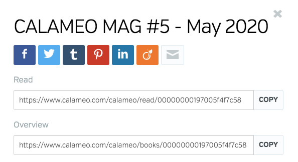
Whether you’re sharing sales material with a potential customer, circulating a memo to your team or publishing a magazine, you want information about how it is being viewed. Filesharing services generally do not provide readership statistics, so you won’t know if your audience has opened your document a dozen times or not at all. As an alternative to filesharing, opt for creating a digital publication on Calaméo. You’ll get insights on views and a full range of advanced statistics.
Limited enrichment
Although some filesharing services let users add external links and images to their documents, the possibilities for creating interactive publications are limited. With the Calaméo Editor, you can add links, video, audio and more to your publications in just a few clicks. Then all you have to do is share!
Privacy headaches
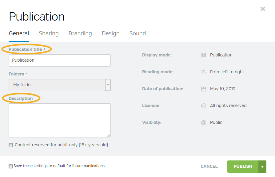
Filesharing services often require users to choose between making their documents available to everyone and approving viewers for private documents one-by-one. Want a single, private link to send to your whole mailing list? It’s easy with Calaméo. Just select “Allow access with a private URL” in your publication’s Properties. If you need more security, set up password protection for your documents with our Subscribers feature.
One look fits all
Since filesharing solutions focus on drafting, editing and modifying documents, they offer few options for tailoring your publication’s final appearance to your needs. Digitally published documents benefit from a dedicated viewer and on Calaméo, it’s fully customizable. You can add a logo, change the colors and even add your own buttons so that your publication matches your brand perfectly.
While filesharing services can be great for collaboration, digital publishing is a better fit for sharing professional, interactive documents with your audience. You’ll enjoy publications that look polished, smart privacy controls and advanced readership statistics. And the best part? Publishing on Calaméo is a breeze.
Sign up for free and start sharing smarter documents today!
One of the biggest benefits of digital publishing is the direct contact any business can establish with its clients. Whether you distribute a product catalog, magazine, flyer or report online with Calaméo, you can reach your customers, prospects and a global readership all at once!
In this article, we’ll explain smart strategies for using digital publishing to connect with local, national and international audiences.
Make a local impact
As more and more people turn to the Internet for local information, creating a strong online presence for your business is essential. Publishing your documents digitally on Calaméo is a fast and simple way of making the information available to your community on the web. Plus, your publications will benefit from our high PageRank for improved visibility in search results.
Having a special event or in-store sale? When you publish your flyers and posters on Calaméo, they’re instantly shareable. Post them to your social media accounts and community groups to let your neighbors, followers and customers know what’s on!
Reach clients online
Catalogs and reports are valuable sales and marketing tools, but they can be challenging to use effectively. Printing and distribution are often costly while simply uploading a PDF version to your website fails to provide an optimal user experience.
Transforming your business’s catalog into a digital publication takes just a few seconds with Calaméo’s powerful technology. Then, you can enrich it with external links to help readers shop your products. This example from Éditions Retz takes advantage of link labels to include strong calls to action:
Embed your finished digital publication in your business’s site for your clients to browse and for future clients to discover!
Target global users
Although you may already be thinking of local and national audiences for your business, publishing digitally also offers international exposure. For example, Gruppo Food’s Italian Taste Journey series introduces food lovers everywhere to the specialties of different Italian regions.
Our advanced statistics show where your readers are located globally, so you can identify which places around the world are interested in your publications. If the results surprise you, it could be an opportunity for growth! You might consider tailoring your content to this international audience, or adjust your advertising.
💡 TIP: BASIC and PREMIUM accounts can see their readership’s top three countries, while PLATINUM accounts can dig into the full list!
With these tips for communicating with different types of audiences, you’ll be well-equipped to get the most value out of digital publishing for your business.
Interested in testing the full range of readership statistics on Calaméo? Our no-commitment PLATINUM Demo is free for 14 days. Let us know if you’d like to try it!
Have you ever seen an advertisement and immediately known which company it belonged to, even if you didn’t glimpse the name? Chances are you recognized certain facets of that company: special fonts, taglines, logos, and color combinations that belong unmistakably to a brand. These elements, and more, make up a brand’s identity. All visual and editorial aspects of a brand’s identity are determined by the brand’s style guide.
On the Calaméo blog we have talked about logos, brand identity and brand image. Next up? Brand style guides, sometimes called graphic charters or brand guidelines. In this article we will discuss the ins and outs of this important document, so let’s dive in!
First thing’s first: what is a brand style guide? A brand style guide is a document that governs all the visual (and sometimes editorial) elements of a company that make it recognizable and unique. It also explains when and how to use these elements. Simply put, a style guide is the key to all communications!
These guides ensure that there is no confusion when it comes to what the brand’s content should look and sound like. Using the guide as a reference, all company communications are consistent across channels and mediums. The style guide can be as detailed as you like; typically, larger companies have more comprehensive style guides because they are more likely to use a wider range of communication channels, and they appear in more places (television, print, online, etc.).
Who creates the style guide?
The creation of brand style guides is best left to professionals. However, it’s a collaborative process: graphic designers or design firms will work with you to create a style guide that suits your company and fits your brand identity. You must decide who you are, your values, and the image you’d like to portray to the world.
Why and how should you use a style guide?
A brand style guide is essential for your company’s brand identity. In order to maintain clear and cohesive communications across all channels, a style guide is the ultimate reference. Internal documents such as slide decks and employee newsletters, external communications such as advertisements or social media posts, plus everything in between: all of this content must look similar and adhere to your brand identity. To achieve this consistency, companies must have a brand style guide. Otherwise, logos may appear in the wrong colors and dimensions, there won’t be a uniform look to your communications, and your tone will be all over the place. Any communication that comes from the company, both internally and externally, should use the style guide as a reference.
What is included in a style guide?
Length and details may vary depending on the company, but a brand style guide is usually made up of the following visual and editorial elements:
Logo
Logos are a crucial part of a brand’s identity, its most visible identifier. Logos are images, texts, or shapes (or a combination of the three) in the company’s color palette that represent the company. A blue bird invokes Twitter, three stripes on a sneaker will certainly mean that they are Adidas, and a swoosh (both the shape and the word) is emblematic of Nike.
A company’s logo cannot be used haphazardly. The brand style guide should explicitly outline the exact colors and dimensions of the logo. Even the background on which the logo appears is specified in the style guide.
Take Calaméo’s logo, for example. The spacing and colors are exact: the dimensions around the lettering are determined by the height of the green accent, and the colors are specific to our brand.
There are other elements to consider. Do you have a slogan or motto with words as part of your logo? If so, you must clearly state where the slogan goes, how big it can be, the color(s) to use, and when to employ this version of the logo. There are many rules you must define in your brand style guide, especially when it comes to your logo.
Colors
Companies have specific brand colors, usually two to three, that they use in logos and branding. The style guide will include complementary colors as well. These colors all together are known as the company’s color palette.
Great thought and care go into a company’s color palette. There are even psychological tricks behind choosing certain colors that the company wants associated with the brand or product. They may want to demonstrate trust, youth, sophistication, or other descriptors.
The brand style guide should outline all the ways to find these colors: a visual representation of the color, HEX and RGB formats, and other formats if necessary. Rather than just “blue” or “red”, companies choose very specific shades of these colors that go well together and set them apart from other brands. These exact shades need to be used every time.
Examples of Calaméo’s color palette using the HEX values
Typeface
Another important element of the brand style guide is typeface. Typeface is the kind of lettering used in communications, which includes fonts. Does your company use only lowercase letters? All capitals? You must include the size, spacing, and color of your typeface in your style guide so employees know exactly how the typeface should look.
Work with a graphic designer to choose the best typeface for your company. Some brands even create their own fonts! Keep in mind that your typeface also reflects your tone– is it silly, serious, elevated? Your typeface must work well with the other elements of your style guide.
Images
Some brand style guidelines include rules about styles of images or photographs to use. These images must fit into the brand’s identity and remain consistent; you should not use a bright and airy photograph one day and then a dark and moody photograph the next. The rules could include using colors from the company’s color palette or desired emotions that the images should evoke (energetic, powerful, soothing). Images are available to download on sites like Getty Images, Shutterstock, or Unsplash, if your company does not have access to a photographer or photography studio to create your own images. However, make sure to check that you have the right to use the images.
Icons
Brand style guides may also include illustrations or icons. Consider the icons you see on a company’s website: a shopping cart to click on when you are ready to purchase or an envelope icon if you want to communicate with the company via email. These icons must be coherent across all platforms. Icons will, much like the rest of the elements of the style guide, reflect the brand identity. Whimsical, rigid, colorful, playful…your icons can express a lot about your brand!
A few of Calaméo’s icons
Tone
Your tone and voice give your brand a personality via the written word. Once you decide who you are, it should be easy to find your company’s tone The brand style guide may include different instructions depending on the channel– perhaps your social media tone will be slightly less formal than that of your advertisements, for example. The guide should include written examples so employees can see how to employ the tone in different situations. Think of the image you want to project, and stay consistent.
Applying your style guide to digital publications
So now that you know all about style guides, it’s time to apply this knowledge to your digital publications! Because digital publishing is a visual medium, consistent brand visuals make all the difference between an amateur-looking document and a professional-grade publication.
With Calaméo, you can personalize your viewer Theme, add your logo, and enrich your content yourself so that your digital publications match your brand identity. With our White Label feature for PLATINUM members, your publications appear in your name and image, without the Calaméo logo. Start your free trial today!