The ability to include external links is a key feature of digital publishing. For many publishers, increasing the number of readers who click on their links is an important goal. The click-through rate (CTR) of a link will tell you which percentage of total viewers clicked on it. So what are some quick steps you can take to boost CTR in your digital publications?
Start Linking
The first step to boosting your CTR couldn’t be simpler: add external links to your publications! You can insert links with our easy-to-use Editor once your document has been uploaded to Calaméo. If you prefer to include links in your original document, be sure that you format them correctly and they will be automatically converted in your publication.
Consider Mobile
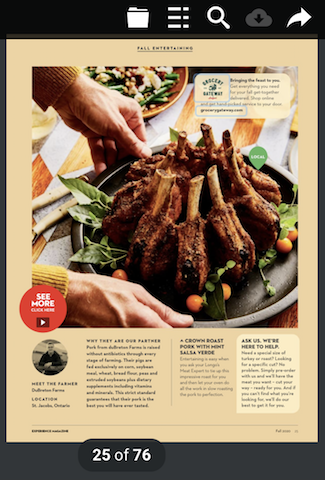
Did you know that over 50% of Internet users worldwide browse on their mobile devices? It’s true—and means you should always check how your links look on mobile. Thanks to our HTML5 viewer, your publications on Calaméo always display perfectly on any device. For example, this page from Longo’s Magazine with video and external links looks beautiful on a smartphone:
To ensure best results, we recommend opening your publication on your phone and test clicking. You may want to adjust the size of your links or experiment with custom link colors and behaviors to optimize them for mobile.
Include a CTA
Now that your readers can see all of your links as they page through your publication, it’s time to tell them why they should click. In other words, you can help improve your CTR with a “Call to Action” (CTA)! A good CTA will briefly give your audience an idea of what they’ll be doing once they click your link. To add a CTA to an external link on Calaméo, first open your publication in the Calaméo Editor. Next, select the link icon and type the CTA in the “Label” field.
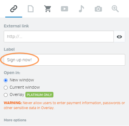
The example above shows a strong CTA for a link to more information about an event or activity. Readers will know that by following the link, they can register for the event that interests them.
Analyze What Works
Understanding which of your external links have the highest click-through rate can offer valuable lessons. Is there a particular CTA that performs better than the rest? Perhaps links placed on a specific page or even on a certain spot receive more clicks than others. With advanced PLATINUM statistics, you enjoy access to a detailed breakdown of link clicks for each of your publications.
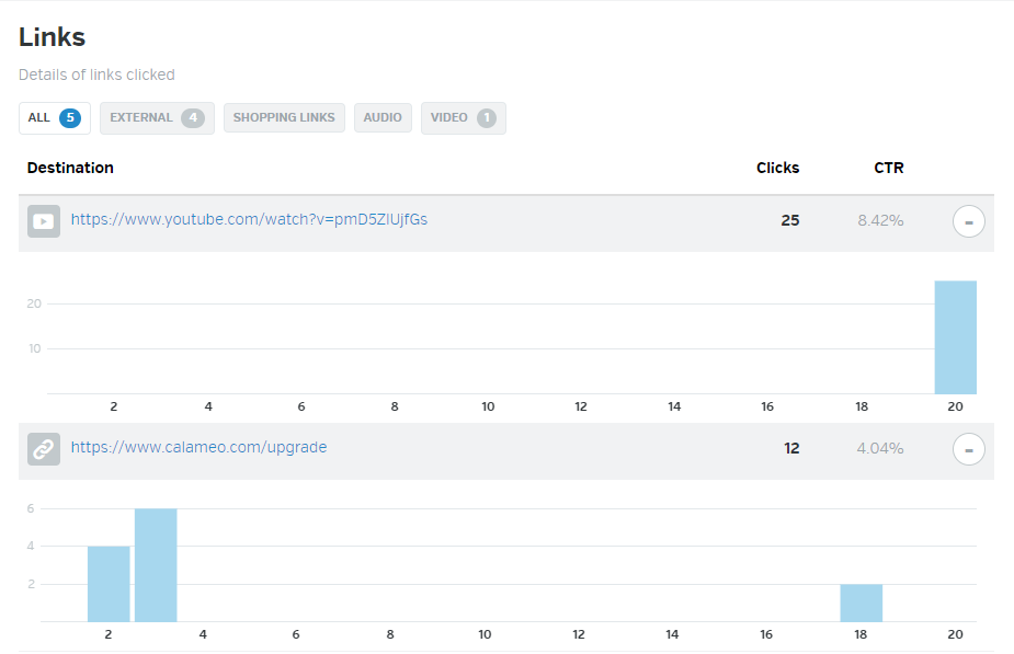
See the number of clicks on every link, including audio and video elements. Plus, the CTR is calculated for you automatically.
Equipped with these quick tips, you should in great shape to optimize your external links and boost CTR for your publications on Calaméo. Want to go even further to drive traffic to your website? Check out our post on 5 Ways to Increase Your Website Traffic with Calaméo!
If you have questions about your Calaméo statistics, it’s no problem. Visit our Help Center for more information or write to us at contact@calameo.com anytime.
You can’t have missed it: in graphic design, the color blue is everywhere. It’s even the most popular color for logos! So, from turquoise to sapphire, cobalt to azure, let’s investigate why blue is so ubiquitous.
Here is a quick summary of the themes that we will cover in this article:
Let’s start with an accurate definition of the color blue.
Blue: a simple primary color?
As we learned early on at school: blue is a primary color. However, it’s not quite that simple. In the additive color model (or RGB for Red, Green, Blue), which is used to define the colors diffused on our screens on websites and digital communications, blue is indeed a primary color. Yet for printed materials, the primary blue shade used is actually a cyan tint (blue-green). The printing industry uses the subtractive color model, or CMYK for Cyan, Magenta, Yellow, Black.
The many hues of blue
Blue is a chromatic color, composed of hundreds of shades between green and violet.
Although blue is considered a cool color (as opposed to a warm red), shades of blue can be warmer or cooler depending on their undertones. The undertones are the secondary colors that are mixed with your blue: a little green will give you a peacock blue or teal, for example.
In addition, saturation also plays an important role: from a dull hue (blue-gray) to a vibrant hue (electric blue).
Finally, brightness will also determine your shade of blue: from a deep, dark shade like midnight blue, to a light shade like sky blue.
So, if you used to say that blue was your favorite color, you can now be more precise! As we have just seen, the range of blue is very wide. You probably have a preference between navy blue, pastel blue and electric blue!
💡TIP: The choice is yours! Be creative when choosing a shade of blue, don’t use a shade that is too close to your competitors’.
Blue and civilizations: history and perceptions
Now that we have defined the color blue, let’s begin to answer our question about the ubiquity of this color in graphic design by focusing on its history and its relationship to past and present civilizations.
A short history of the color blue
The birth of “blue”
This may surprise you, but blue was only born in the Middle Ages. Before that, neither its name nor its concept had been defined. In other words, blue was not a notion that existed at that time for human beings. However, this does not mean that there were no blue objects, just that blue was not considered a color in its own right. Anything blue was described with the colors that existed at the time. It’s very difficult to conceive of in this day and age!
A history of pigments
Blue is rarely found in nature, and natural blue pigments are therefore scarce. As a matter of fact, the only natural blue pigments come from indigo (a plant), pastel (a plant) and lapis lazuli (a mineral).
Civilizations quickly learned how to create synthetic blue pigments. The first of these was invented by the Egyptians in ancient times, called Egyptian blue. Prussian blue, Cobalt blue and Phthalocyanine blue are some other examples of synthetic blue pigments.
It is interesting to note that although blue did not yet have a name, human beings already seemed to be fascinated by this color to the point of trying to create pigments.
Blue and perceptions
Past perceptions
Today, blue is a color that is part of our daily lives, but this was not always the case. In ancient Rome, blue was despised: it was a symbol of ridicule and even associated with barbarians.
From the Middle Ages, the color took on a divine connotation and it started to appear on many religious works of art. It then became the color of the monarchy (of divine rights) a little later.
Finally, in the 20th century, all of humanity embraced the color blue when blue jeans came into fashion.
Current perceptions
As we have seen, depending on the era or culture, the feelings and connotations associated with certain colors can vary. Let’s take a look at current perceptions around the color blue.
In English, we say “feeling blue” to describe feelings of depression, but when we have “blue skies ahead” it means that we are optimistic about the future. In French, “être fleur bleue” means to be romantic or sentimental, and “avoir une peur bleue” means scared to death! So, blue can evoke several disparate images depending on the language.
Here are a few examples of different perceptions associated with the color blue:
Current universal perceptions
confidence
security
eternity
calm
peace
freedom
nostalgia
Specific cultural perceptions
nobility, royalty: royal blue, to have “blue blood”
workers: “blue collar” laborers, as opposed to “white collar” office workers
💡TIP: Although the feelings commonly associated with the color blue are calm and confidence, it is always a good idea to check the perception of each hue you plan to use in your communications against your target audience and their culture.
Blue in art
We couldn’t talk about blue in graphic design without also mentioning blue in art. Of course, graphic design draws inspiration from art! We can find blue in many works of art: from Van Gogh’s Starry Night to Hokusai’s The Great Wave to Andy Warhol’s Colored Mona Lisa.
So, while we will only cite a few interesting examples of the use of blue in art below, there are certainly many others.
The Jardin Majorelle
Have you heard of this villa and garden in Morocco, painted entirely in a special cobalt blue shade? It has become a very famous destination because it is so unique.
French painter Jacques Majorelle was inspired by Marrakesh and built a villa with its own botanical garden in the 1930s. But he did not stop there, he also created the “Majorelle blue” color and decided to paint the walls of his villa with it.
This garden has become a huge source of inspiration for artists and creatives, notably for French fashion designer Yves Saint-Laurent.
💡 REMEMBER: Use blue in bold, new, unexpected, and inspiring ways.
Yves Klein: IKB blue
Let’s focus now on another inventor of blue: Yves Klein. He is the creator of IKB blue, or International Klein Blue, a shade close to ultramarine blue. He is a visual artist who used his invention, the IKB, in many works, including monochrome, meaning using only this color.
💡 REMEMBER: You can use blue as a trademark, a unique blue that makes you recognizable.
Picasso: the Blue Period
Our final example of the use of blue in art is Picasso’s Blue Period from 1901 to 1904. Deeply affected by the death of a loved one, the young painter began to paint in shades of blue to express his grief.
💡 REMEMBER: Colors can relay messages and express feelings.
Blue in graphic design and brand visual identity
After our extensive theoretical overview on the color blue, which we hope will have convinced you of its importance, let’s move on to a practical study: how do brands use blue? Plus, how to use it well in your brand identity and, by extension, in your digital publications on Calaméo.
Because blue is humankind’s favorite color, it seems obvious that using it in your designs is a good idea since it will appeal to a very large portion of your clients and prospects. In addition, there are many positive associations with this color: confidence, peace, calm. People will associate your brand with these qualities instantly.
So, just by using blue in your brand style guide, the public will have a positive perception of your brand.
For the user experience
In graphic design, it’s important to focus on the user experience and make it as pleasant as possible for everyone. Blue being the color least affected by color vision disorders, it is a good choice for your graphic design.
Examples of blue in brand style guides
To help you use blue in your visual identity and in your communications, here are some interesting examples of the use of blue in brand style guides and good ideas to inspire your creativity.
Ikea: unmistakable
How can we talk about blue in graphic design without talking about Ikea? Ikea uses two strong colors that stand out and give a unique and recognizable visual identity. It’s probably the only furniture store that you are able to recognize from afar, wherever you are in the world, thanks to its blue and yellow sign and blue exterior.
💡 REMEMBER: Partner two strong colors that contrast, such as complementary colors, for a big impact. For example: combine blue with orange or yellow tones.
These distinctive colors reflect those of the Swedish flag. This choice reinforces Ikea’s brand identity: from the names of the products to the types of dishes offered in their restaurants to their brand style guide…all of these elements emphasize the company’s origins.
💡REMEMBER: Use specific colors to reinforce your brand identity.
Major players on the web: all in shades of blue
Among the major Internet companies, almost all of their logos are blue. You can see some examples above. What at the beginning was perhaps a strategic choice seems to have turned into a trend. We can imagine that the choice of a blue logo of the first entities on the Internet reflects the desire to have an image of stability and confidence in this new virtual world that seemed ephemeral. As a result, blue logos are now associated with tech and web companies.
💡REMEMBER: Study your competitors and their brand style guides; if they all use the same codes, there may be a reason.
Calaméo: blue for emphasis
Finally, we wanted to tell you about our use of blue. Although blue is not our main color and does not appear in our logo, we do have a very specific use for it. We use blue to highlight and emphasize important messages. As you can see, on our blog the links are in blue and stand out.
💡REMEMBER: You can use a shade of blue in your graphic design without it being a main color. Do not hesitate to give it a specific function.
In this respect, many brands use blue in their visual identity, and the color performs different functions for each. From main color to accent color, it is a matter of finding the best way to incorporate this color in your style guide so that it completes your brand and identity.
Blue is a fascinating color: its history, its many uses in art, and all its different meanings and connotations. That’s why blue has become an essential color in graphic design.
Don’t hesitate to use it in your brand identity and in your digital publications. Blue used with ingenuity, in an original shade or in combination with unusual shades, will make you stand out and will make your content unforgettable.
The year 2025 is upon us, with its share of new trends and changes in digital content creation. Whether you’re a creator, publisher or marketer, it’s crucial to stay on top of the developments that will transform the content landscape. At Calaméo, we’ve identified five key trends that will shape 2025 and beyond. Find out how these trends will redefine the way content is created and consumed.
1. AI and content creation
Artificial intelligence is more than ever at the heart of content creation. By 2025, AI tools will be ubiquitous, facilitating the creation of articles, videos, images, and even personalized marketing campaigns. These technologies not only save time, but also improve the quality and relevance of content for each user.
Why is it important?
Content creators who integrate AI into their strategy will be able to personalize their messages on a massive scale, offering a unique and engaging experience to their audience.
2. Interactive and immersive video content
Interactive videos, combined with augmented reality (AR) and virtual reality (VR), will take center stage in content strategies. Consumers are looking for immersive experiences, and these formats enable direct interaction with brands.
How can we prepare for this?
Investing in immersive video production and AR/VR technologies can help you stand out from the crowd and capture your audience’s attention in innovative ways.
3. Next-generation user-generated content (UGC)
User-generated content (UGC) will evolve towards more creative and interactive formats. Brands will encourage their communities to create and share authentic content via AR filters, social media challenges and collaborations with influencers.
Tip for 2025
Encourage your users to become content creators by providing them with the tools and incentives to generate quality content. This will boost your audience’s engagement and loyalty.
4. Micro-content and snackable content
Micro-content, in the form of short videos, stories and image carousels, will continue to dominate social media in 2025. Platforms like TikTok, Instagram Reels and YouTube Shorts will remain the preferred places to consume quick, captivating content.
Why bet on micro-content?
Internet users have increasingly short attention spans, and micro-content makes it possible to convey clear, hard-hitting messages in just a few seconds.
5. Focus on sustainability and ethics
Today’s consumers expect brands to be transparent and committed to responsible practices. Content focused on sustainability, inclusivity and ethics will become an essential criterion for attracting and retaining an audience aware of these issues.
How can you integrate sustainability into your content strategy?
Be authentic in your approach. Highlight your actions in favor of the environment and inclusiveness, and show how your values translate into your business practices.
Conclusion
2025 will be a year of technological innovation and increased demand for authentic, engaged content. By integrating these trends into your content creation strategy, you’ll be able to capture your audience’s attention and strengthen your positioning in an ever-changing digital environment.