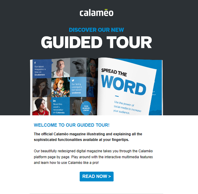
Digital design is always evolving and in recent years user experience has been a major focus. Also known as UX, user experience involves improving how people interact with digital products and services. And it’s become a key investment for modern businesses. That’s because a great user experience can encourage visitors to spend more time on your website, help them view your brand positively and even increase sales.
Luckily for our publishers, Calaméo offers an exceptionally user-friendly HTML5 reader that allows their documents to shine on every device. But there are a few simple steps you can take to create an even better experience for your online audience! Learn about four essential UX principles and how to apply them to your digital publications.
Use consistent visuals
A top rule for ensuring great user experience is committing to one, coherent graphic design. Whichever fonts, colors and layouts you have chosen for your documents, they should match the visual identity of your business. Otherwise, too many different graphic elements risk overwhelming your online audience and can negatively impact UX.
So how do you create a seamless visual transition between your brand and your digital publications? To start, you can customize the appearance of the viewer. For example:
Choose a background for the viewer to harmonize with your website.
Build a custom theme and fine-tune the viewer right down to the font.
Reduce friction
For UX designers, “friction” is anything that gets between users and their goals. For digital publishers, this often means not ensuring optimal readability for their online documents. When publishing on Calaméo, take a moment to select the best options for your publication in its properties. Easy ways to reduce friction include:
Thanks to decades of digital culture, certain features of user experience are already understood and expected by just about everybody. For instance, Internet users expect that clicking a logo in the top left-hand corner of a web page or window will return them to the home page.
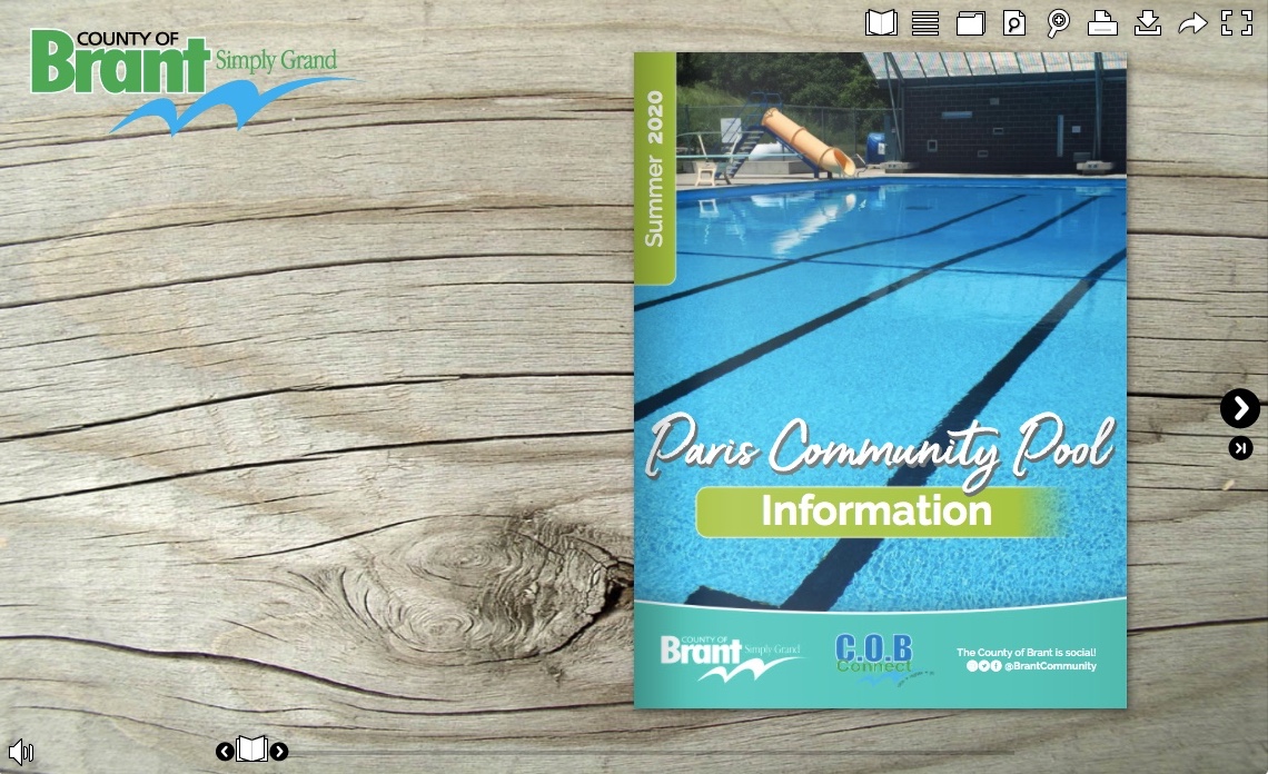
The publication above from County of Brant shows a great example of this strong UX element. With Calaméo, it’s simple to place your logo directly in the viewer and add a link. Take advantage of it in your digital publications to increase traffic to your site!
Encourage action
Do you wish you could:
Let your readers follow your business’s social media accounts in just one click?
Modify a button in the viewer to include a call to action, such as “Download now”?
Create a smart contact button in the viewer to help generate leads?
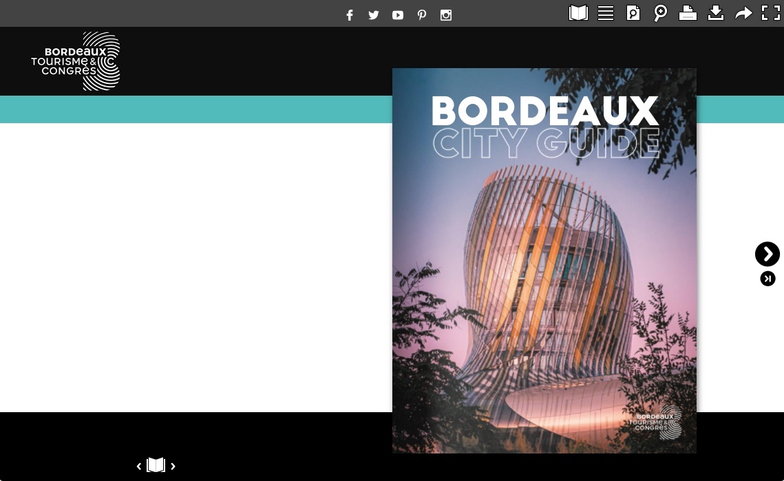
Then you need to explore Calaméo’s custom themes feature. Because of its unique flexibility, you can adapt the user experience of your digital publications to best serve your business’s goals. Check out this example from Office de Tourisme de Bordeaux Métropole:
We’ve put together an illustrated tutorial to show you how to get started customizing your theme. But to discover the full range of possibilities, take a look around our Developer resources.
From one-click options to made-to-measure themes, Calaméo gives you powerful tools to create the best possible user experience for your digital publications.
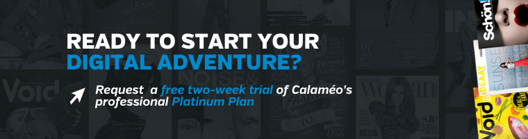
Our PLATINUM plan includes all the must-have features to boost your digital publications’ UX. Request your free, two-week demo and try them out today!
As a real estate agent, you need content to attract customers and sell properties. By creating quality content, you can stand out from the competition and establish your expertise. In this article, we’ll discuss three ways to create content for real estate players.
Use quality photos and videos
Photos and videos are essential for selling a property. You need to ensure that photos and videos are of professional quality. This means using a quality camera and having a good command of angles and lighting. It’s also important to highlight the key features of the property for sale. Videos are an excellent way of showing potential customers all the details.
Create educational content
In addition to promoting properties, real estate agents can create educational content to establish their expertise. This can include blog posts on local real estate market trends, property buying guides or tips for sellers. Potential customers will appreciate educational content and be more inclined to trust you to guide them through the buying or selling process.
Publish on Calaméo
Calaméo is an excellent tool for real estate agents looking to create digital content. You can publish digital brochures to showcase properties, for example. These brochures can include photos and videos, as well as detailed property descriptions. What’s more, our EDITOR tool lets you add links and redirect your customers directly to your website. We also recommend using Calaméo to share white papers and educational articles about the real estate industry.
Conclusion
Creating quality content is essential for real estate agents. Professional-quality photos and videos are essential for selling a property. You also need to offer educational content to establish your position as an expert. Finally, Calaméo is an excellent tool for creating professional-quality digital content.
Have you ever seen an advertisement and immediately known which company it belonged to, even if you didn’t glimpse the name? Chances are you recognized certain facets of that company: special fonts, taglines, logos, and color combinations that belong unmistakably to a brand. These elements, and more, make up a brand’s identity. All visual and editorial aspects of a brand’s identity are determined by the brand’s style guide.
On the Calaméo blog we have talked about logos, brand identity and brand image. Next up? Brand style guides, sometimes called graphic charters or brand guidelines. In this article we will discuss the ins and outs of this important document, so let’s dive in!
First thing’s first: what is a brand style guide? A brand style guide is a document that governs all the visual (and sometimes editorial) elements of a company that make it recognizable and unique. It also explains when and how to use these elements. Simply put, a style guide is the key to all communications!
These guides ensure that there is no confusion when it comes to what the brand’s content should look and sound like. Using the guide as a reference, all company communications are consistent across channels and mediums. The style guide can be as detailed as you like; typically, larger companies have more comprehensive style guides because they are more likely to use a wider range of communication channels, and they appear in more places (television, print, online, etc.).
Who creates the style guide?
The creation of brand style guides is best left to professionals. However, it’s a collaborative process: graphic designers or design firms will work with you to create a style guide that suits your company and fits your brand identity. You must decide who you are, your values, and the image you’d like to portray to the world.
Why and how should you use a style guide?
A brand style guide is essential for your company’s brand identity. In order to maintain clear and cohesive communications across all channels, a style guide is the ultimate reference. Internal documents such as slide decks and employee newsletters, external communications such as advertisements or social media posts, plus everything in between: all of this content must look similar and adhere to your brand identity. To achieve this consistency, companies must have a brand style guide. Otherwise, logos may appear in the wrong colors and dimensions, there won’t be a uniform look to your communications, and your tone will be all over the place. Any communication that comes from the company, both internally and externally, should use the style guide as a reference.
What is included in a style guide?
Length and details may vary depending on the company, but a brand style guide is usually made up of the following visual and editorial elements:
Logo
Logos are a crucial part of a brand’s identity, its most visible identifier. Logos are images, texts, or shapes (or a combination of the three) in the company’s color palette that represent the company. A blue bird invokes Twitter, three stripes on a sneaker will certainly mean that they are Adidas, and a swoosh (both the shape and the word) is emblematic of Nike.
A company’s logo cannot be used haphazardly. The brand style guide should explicitly outline the exact colors and dimensions of the logo. Even the background on which the logo appears is specified in the style guide.
Take Calaméo’s logo, for example. The spacing and colors are exact: the dimensions around the lettering are determined by the height of the green accent, and the colors are specific to our brand.
There are other elements to consider. Do you have a slogan or motto with words as part of your logo? If so, you must clearly state where the slogan goes, how big it can be, the color(s) to use, and when to employ this version of the logo. There are many rules you must define in your brand style guide, especially when it comes to your logo.
Colors
Companies have specific brand colors, usually two to three, that they use in logos and branding. The style guide will include complementary colors as well. These colors all together are known as the company’s color palette.
Great thought and care go into a company’s color palette. There are even psychological tricks behind choosing certain colors that the company wants associated with the brand or product. They may want to demonstrate trust, youth, sophistication, or other descriptors.
The brand style guide should outline all the ways to find these colors: a visual representation of the color, HEX and RGB formats, and other formats if necessary. Rather than just “blue” or “red”, companies choose very specific shades of these colors that go well together and set them apart from other brands. These exact shades need to be used every time.
Examples of Calaméo’s color palette using the HEX values
Typeface
Another important element of the brand style guide is typeface. Typeface is the kind of lettering used in communications, which includes fonts. Does your company use only lowercase letters? All capitals? You must include the size, spacing, and color of your typeface in your style guide so employees know exactly how the typeface should look.
Work with a graphic designer to choose the best typeface for your company. Some brands even create their own fonts! Keep in mind that your typeface also reflects your tone– is it silly, serious, elevated? Your typeface must work well with the other elements of your style guide.
Images
Some brand style guidelines include rules about styles of images or photographs to use. These images must fit into the brand’s identity and remain consistent; you should not use a bright and airy photograph one day and then a dark and moody photograph the next. The rules could include using colors from the company’s color palette or desired emotions that the images should evoke (energetic, powerful, soothing). Images are available to download on sites like Getty Images, Shutterstock, or Unsplash, if your company does not have access to a photographer or photography studio to create your own images. However, make sure to check that you have the right to use the images.
Icons
Brand style guides may also include illustrations or icons. Consider the icons you see on a company’s website: a shopping cart to click on when you are ready to purchase or an envelope icon if you want to communicate with the company via email. These icons must be coherent across all platforms. Icons will, much like the rest of the elements of the style guide, reflect the brand identity. Whimsical, rigid, colorful, playful…your icons can express a lot about your brand!
A few of Calaméo’s icons
Tone
Your tone and voice give your brand a personality via the written word. Once you decide who you are, it should be easy to find your company’s tone The brand style guide may include different instructions depending on the channel– perhaps your social media tone will be slightly less formal than that of your advertisements, for example. The guide should include written examples so employees can see how to employ the tone in different situations. Think of the image you want to project, and stay consistent.
Applying your style guide to digital publications
So now that you know all about style guides, it’s time to apply this knowledge to your digital publications! Because digital publishing is a visual medium, consistent brand visuals make all the difference between an amateur-looking document and a professional-grade publication.
With Calaméo, you can personalize your viewer Theme, add your logo, and enrich your content yourself so that your digital publications match your brand identity. With our White Label feature for PLATINUM members, your publications appear in your name and image, without the Calaméo logo. Start your free trial today!