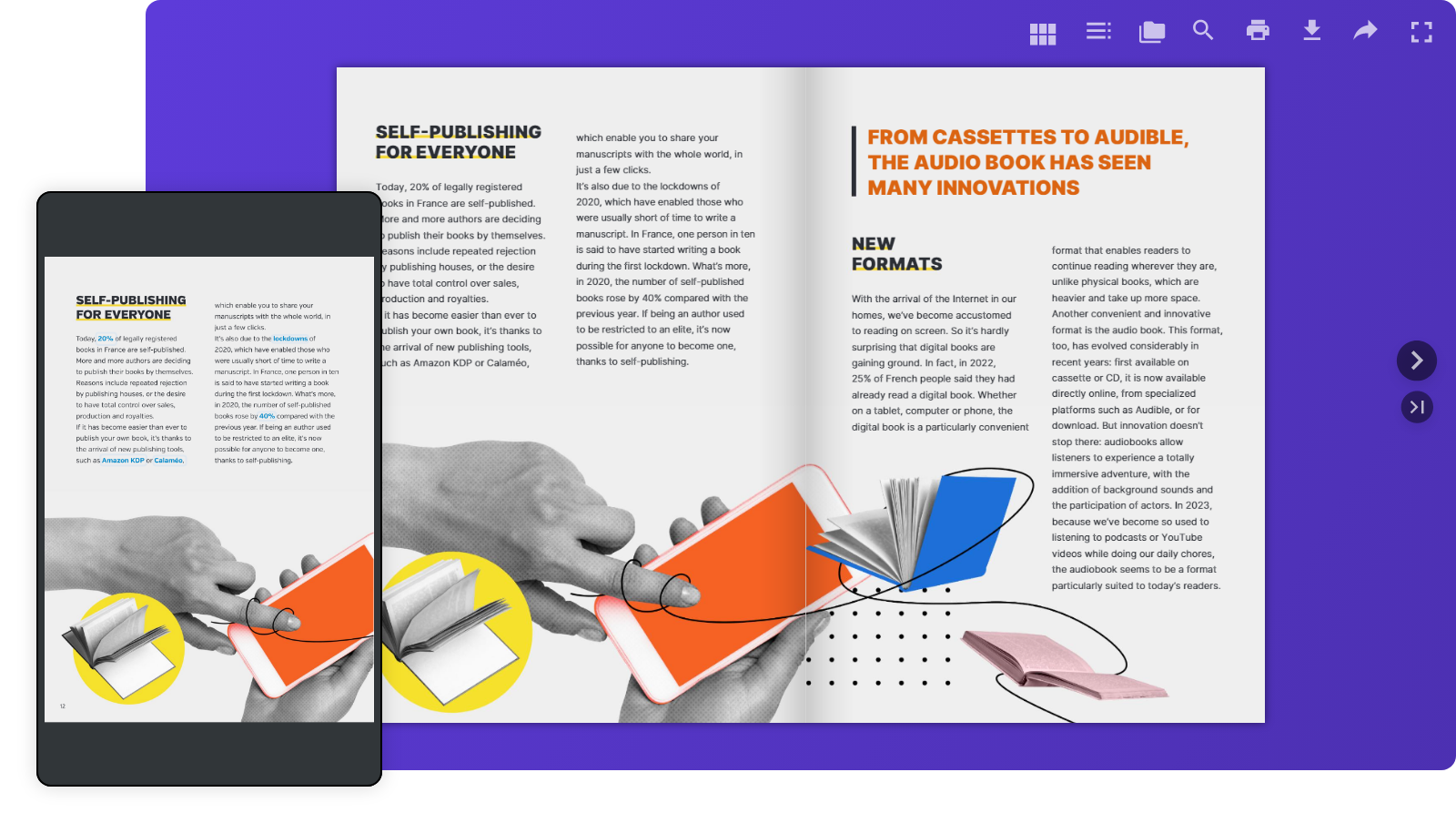
Your readers aren’t tied to one screen anymore. They move from laptops at work to smartphones on the go, tablets at home, and even smart TVs. That’s why making your digital content easy to read everywhere isn’t just nice to have—it’s essential. With Calaméo, your publications are always responsive by design, so your audience enjoys a smooth and intuitive experience on any device.
Responsive design on Calaméo: what does it mean?
Simply put, responsive design makes your publications flexible. They adapt automatically to any screen size—no extra effort required on your part. On Calaméo, this looks like:
Layouts that resizes to fit each device
Effortless navigation whether you’re on desktop or mobile
The benefits for your readers
Comfortable reading, everywhere Our mobile viewer adjusts perfectly to smaller screens, so browsing your publications feels natural.
Fewer drop-offs, more engagement No pinching, zooming, or frustration. Just a smooth reading experience that keeps your audience engaged longer.
Always device-friendly Every Calaméo publication is automatically optimized for all screens—no extra setup needed.
How Calaméo delivers a seamless reading experience
Adjusted layout: your document is resized to fit the device.
Smart navigation: Menus, buttons, and CTAs adjust to make the best use of available space.
Conclusion
With Calaméo, you don’t have to think about screen sizes—your publications are ready to shine everywhere by default. That means your readers get an enjoyable, stress-free experience, and you get more engagement, satisfaction, and visibility.
Ready to see it in action? Publish your next document on Calaméo and give your audience the smooth reading experience they expect—from desktop to mobile.
In the digital age, virtual libraries have become essential tools for organizing, sharing and accessing online resources. Thanks to technological advances and new solutions such as the Library Widget from Calaméo, it’s easier than ever to create a virtual library that meets users’ modern needs. In this article, we’ll explore the key steps to creating your own virtual library and show you how to make the most of the tools available.
A virtual library is an organized collection of digital documents, accessible online. Unlike ordinary libraries, virtual libraries offer unlimited accessibility, simplified content management and the ability to adapt to the needs of their users.
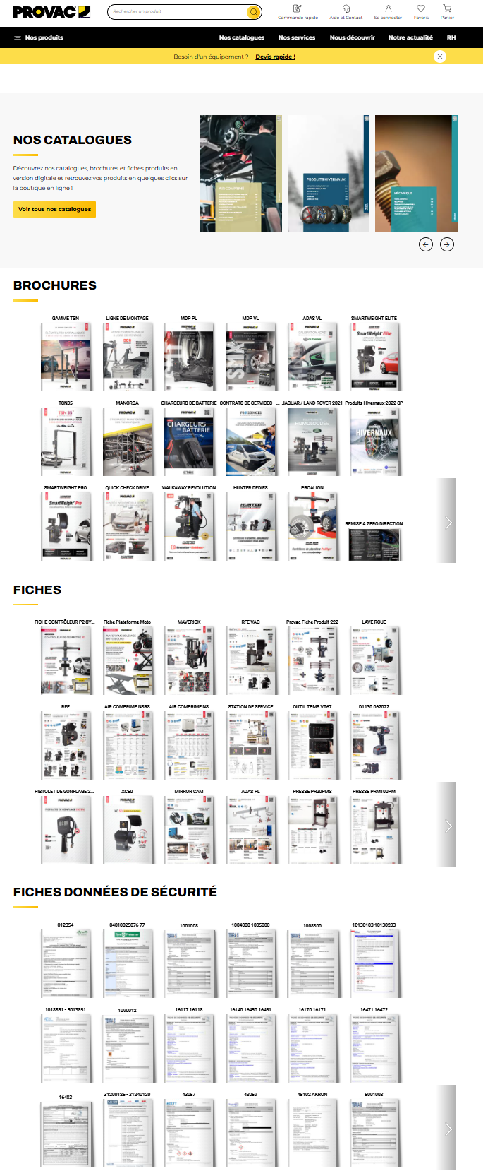
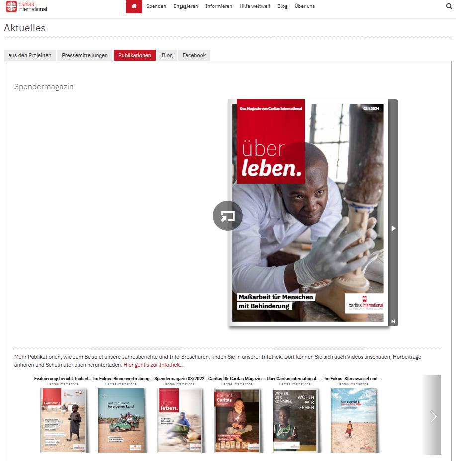
Here’s an example of a virtual library created with Calaméo:
Why you should create a virtual library: the major advantages
Optimized visual display
One of the greatest advantages of creating a virtual library is the simple, interactive way of showcasing your publications. Whether you want to display every issue of your magazine or a varied collection of documents, the virtual library enhances the visual impact of your content. Thanks to intuitive navigation, visitors can easily browse your virtual shelves and click on a cover to open the publication in full screen or in a new window. They can then easily return to your virtual library once they’ve finished reading.
Automatic updates
Automatic updates make it easy to manage your virtual library. Every time you add a new publication to your Library Folder on Calaméo, it instantly appears on your virtual shelves. By choosing to create a virtual library, you’re freed from repetitive manual management tasks. Removing publications is just as easy: mark them as private or move them to another Folder to adjust their accessibility with a few clicks.
In-depth analytics
When you create a virtual library, you also benefit from detailed analytics on how your audience interacts with your publications. You can track views, link clicks, downloads and traffic origin. These analyses enable you to adapt your content to better meet your audience’s expectations and improve engagement with your virtual library.
Why choose Calaméo to create your virtual library?
To create an effective virtual library, it’s essential to choose a platform tailored to your needs. Several solutions are available on the market, but the Library Widget from Calaméo stands out for its ease of use, intuitive interface and numerous advanced features. This solution is ideal for those who want to create a virtual library quickly and without any particular technical skills.
By using this feature, you benefit from :
Easy embeding on your website: Calaméo enables effortless embeding of your virtual library on your website, which means you can showcase your digital resources in a harmonious, professional way.
Visual customization to match your brand: Thanks to a variety of customization options, you can adapt the appearance of your library to reflect your brand identity and blend seamlessly into the pages of your website.
Numerous options for sharing and distributing your publications: With Calaméo, you can easily share your publications on social networks or by e-mail. This enables you to reach a wider audience and increase the visibility of your resources.
Step 1: Publish and organize your documents on Calaméo
Organizing your documents is a key step in ensuring an optimal user experience and smooth navigation in your virtual library. To ensure that your publications are easily accessible and well structured, it’s important to prepare them well before publishing them on Calaméo.
Start by publishing your digital documents on Calaméo. Each publication should be accompanied by a catchy, descriptive title, incorporating relevant keywords linked to your content. Don’t forget to fill in the description of each publication with clear, engaging summaries that will encourage users to discover your content.
Next, organize your publications by placing them in Folders or adding them to a Favorites list. For these documents to be visible in your virtual library, it is essential that Folders and publications are defined as public.
NOTE: Private publications will not be displayed in the Library Widget, giving you total control over what is visible to your users.
All you have to do is select the Folder (or favorites list) whose contents you wish to display in your virtual library. All public publications in this folder will automatically appear in your library, making it easy to manage your documents without any extra effort.
Step 2: Customize the appearance of your Library Widget
Personalizing your virtual library is essential to ensuring a user experience that reflects your brand identity. Thanks to the many customization options offered by the Calaméo Library Widget, you can adjust the appearance of your library so that it blends seamlessly with your website while reinforcing your brand image.
You can adjust the following elements of your Library Widget:
The texture or background color of the library to match the style of your website.
The number of shelves to display to visually organize your publications.
The size of your publication thumbnails for optimized display.
The information to be displayed for each publication (such as title or description).
The order in which your publications appear, allowing you to highlight certain strategic documents.
The way publications open (in a new window or full screen).
You can also adjust the appearance of thumbnails by choosing, for example, a shadow or other visual effects that enhance the impact of your publications. These subtle details play a key role in enhancing the aesthetics and navigation of your virtual library.
TIP: While you’re customizing the look and feel of your Calaméo Library Widget, you can see the changes in real time thanks to the preview function. This allows you to test different configurations and ensure that each modification fits perfectly into your overall site before finalizing the upload.
By customizing your virtual library with these options, you offer your users a fluid, visually appealing experience, while reinforcing your brand identity at every stage.
Step 3: Embed the Calaméo Library Widget into your website
Once you’ve carefully customized the look and feel of your virtual library, the next step is to embed it directly into your website. This step is crucial to making your virtual library accessible to your users and enabling smooth navigation between your content and the other pages of your site.
Embeding the Calaméo Library Widget is quick and easy, and you have several options for doing so. Once you’re happy with the configuration and design of your virtual library, simply copy the embed code provided by Calaméo. This code can be inserted on any page of your website, whether on a page dedicated to your publications or another section of your site.
This intuitive process makes it easy to present your digital document collections in a professional, interactive way.
READ MORE: If you need help with embedding, resources such as the tutorial or the support pagein the Calaméo Help Center are available to guide you step by step.
By embedding a Calaméo library on your site, you enable your visitors to easily explore your digital publications directly from your platform, without having to navigate to another site. This not only enhances the user experience, but also reinforces the consistency of your brand image by providing seamless access to your documents in a controlled environment.
Embeding requires no advanced technical skills and, once the code has been inserted, your virtual library will be automatically updated every time you publish new documents or modify existing ones. So you don’t have to worry about manually keeping your library up to date, which saves you and your team valuable time.
With just a few clicks, you can create a dynamic, scalable virtual library that blends seamlessly with your website, while enriching your users’ experience and facilitating access to your digital content.
Conclusion
Creating a virtual library represents a unique opportunity to modernize your content management and improve access to your digital resources. With the Calaméo Library Widget, you have a powerful and flexible tool at your disposal to set up a virtual library perfectly adapted to your needs.
Don’t wait any longer, transform the way you share information by starting to build your virtual library with Calaméo today!
The YouTube integration in Calaméo offers publishers and content creators a unique opportunity to enrich their online publications. Whether you want to promote your products, offer detailed guides or engage your readers, this integration optimizes the reach and impact of your digital publications. Let’s find out how this YouTube feature can transform your content and energize your audience.
Why integrate YouTube videos into your Calaméo publications?
YouTube is one of the most popular video platforms, ideal for reaching a wide audience. By incorporating it into your Calaméo brochures, catalogs or guides, you add an interactive dimension that attracts readers’ attention and increases engagement.
How can you use YouTube to enrich your publications?
The YouTube integration in Calaméo lets you take advantage of various types of content:
Encourage subscriptions and build audience loyalty
Invite your readers to subscribe directly to your YouTube channel from within your Calaméo publications. By facilitating subscriptions, you boost your visibility on YouTube and keep your audience informed of the latest news.
A product demo for your sales catalogs
Add product demonstration videos to bring your catalogs and brochures to life. Your customers can see your products in action, boosting their confidence and helping them in their purchasing decision.
Tutorials and how-to guides for effective learning
If your content includes training or guides, then incorporate YouTube videos to enrich your educational material. Tutorial videos add considerable value and make concepts easier to understand.
Creating an interactive, immersive experience
YouTube offers interactive features such as comments, shares and calls to action. By adding these elements to your posts, you encourage direct engagement with your content and build a stronger relationship with your audience.
Analyze performance to optimize your content
YouTube Analytics lets you track views, viewing time and engagement of videos embedded in your Calaméo publications. Thanks to this data, you can identify your audience’s preferences and adjust your strategy accordingly.
In conclusion, The YouTube integration in Calaméo is an effective solution for captivating your audience and maximizing the impact of your digital publications. Start enriching your Calaméo documents with YouTube videos today and see the difference!

 Join millions of professionals already using Calaméo. Start your free 14-day trial of Calaméo PLATINUM today and unlock our full set of features.
 Here’s an example of a virtual library created with Calaméo:
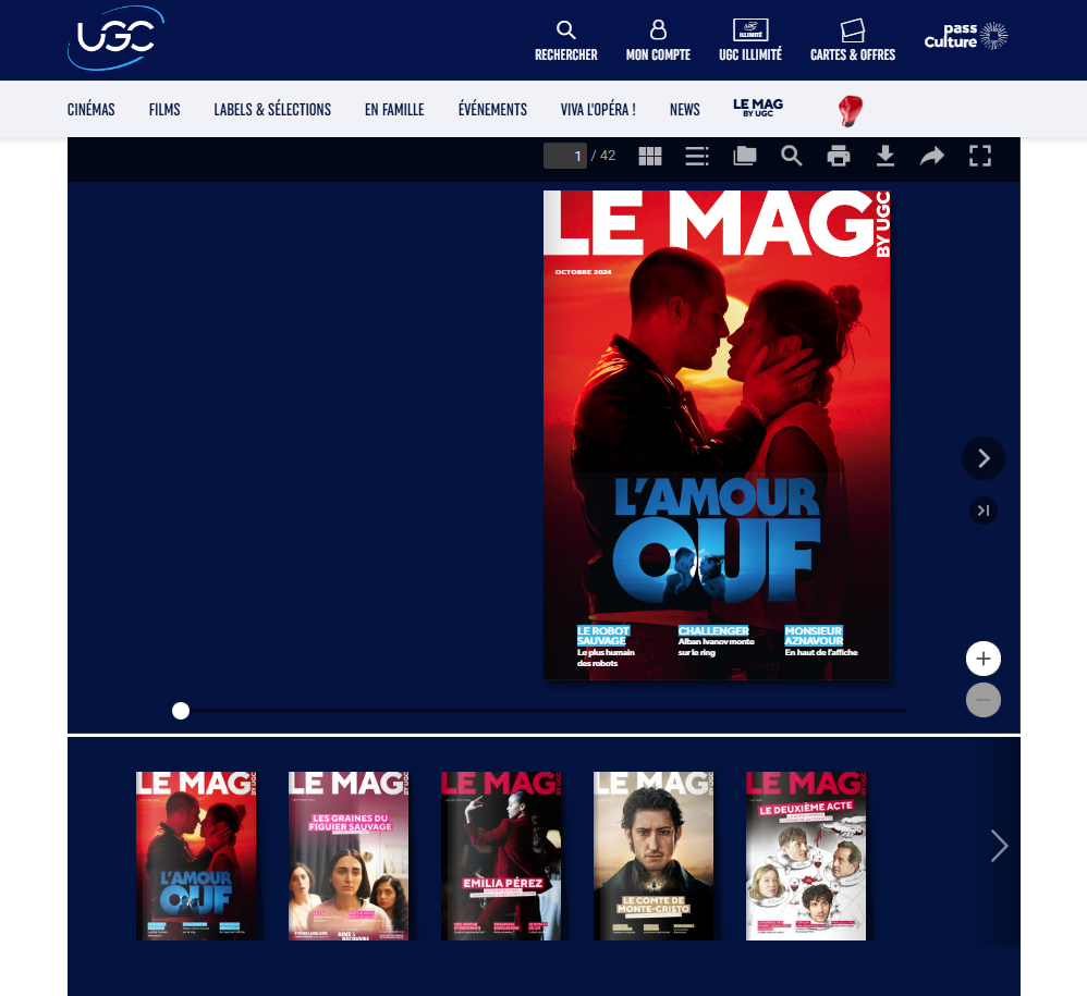
 NOTE: Private publications will not be displayed in the Library Widget, giving you total control over what is visible to your users.
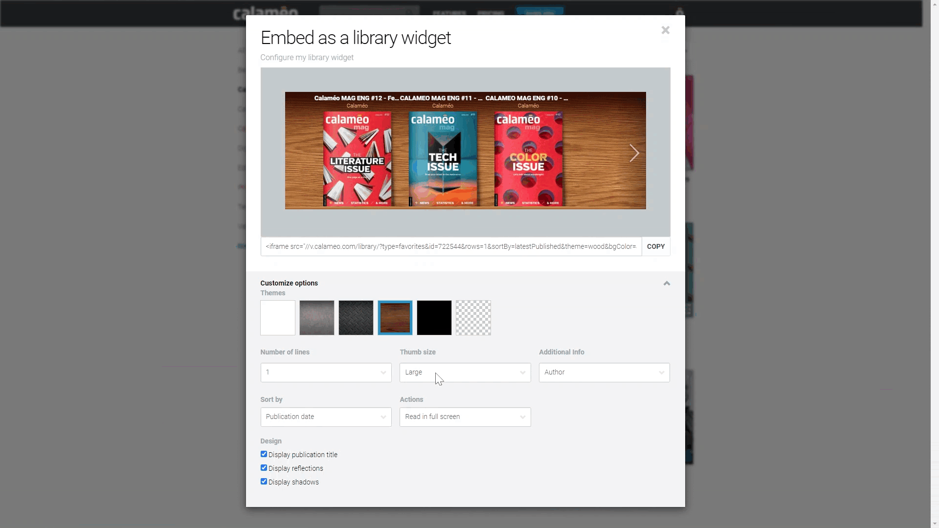

 LEARN MORE: