Thanks to digital marketing, getting the word out about your business has never been easier. However, it often takes time for a potential customer to go from visiting your website to buying your product. A strategy to generate leads can help make sure that you identify interested users. Then, follow up and make the sale!
In this article, we will reveal simple ways to put your digital publications to work as lead generation tools.
The pop-up contact form is a classic method to generate leads online that we have mentioned before here on the blog.
While pop-up forms are a great choice, especially if you are producing exclusive content, they can be time-consuming to manage. Consider an even more streamlined, user-friendly approach: a smart Contact button.
Why does a Contact button help generate leads?
No matter what kind of content you are publishing digitally, you’ll want readers to be able to contact you as easily as possible. Our Editor lets you add links inside your publication for users to email or call your business.
Creating a Contact button makes an easy path from browsing your content to getting in touch. As a result, users benefit and you capture high-quality leads. In fact, this simple tool saves readers from having to:
return to your site
hunt for contact info
open their inbox
enter your email address
That’s a lot of work just to ask a question! Instead, potential customers are free to check out your publication, click your contact link and call or email you instantly.
How to add a Contact button to your publications
Once you have decided where your contact links will appear in your publication, all you need to do is open it with the Calaméo Editor.
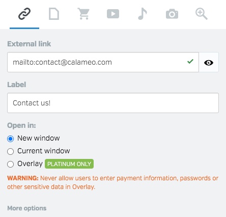
Next, select the External Link icon and draw a link in the place you’ve picked for a contact link.
To create an email message from your contact link, enter “mailto:” followed by your business’s email address in the External link field. If a reader clicks this link, her computer’s email client will open a new message to the chosen address.
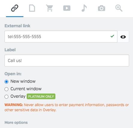
To add a telephone link, enter “tel:” followed by your business’s phone number in the External link field. Your readers can place a call directly from your publication just by clicking the link!
💡 TIP: Note that telephone contact links are only authorized for devices with native telephone capabilities, such as tablets and smartphones. Email contact links work on any device.
How to add a Contact button to the viewer
By investing a little extra time, you can also make use of contact links in our publication viewer to generate leads. We recommend creating a custom Skin to include a Contact button. Here’s an example in the toolbar of our Default:
You can learn more about how to design your own Skin on our Developers page or in our illustrated, step-by-step tutorial. Plus, making changes is easier than ever with our Elements feature, which lets you edit your publication’s viewer Skin right in your Calaméo account.
Whether you prefer a Contact button on the page or in the viewer, it’s a must-have for generating leads from your online content. And with Calaméo, you never have to sacrifice the immersive experience offered by digital publications for seamless customer contact.
In short, contact links are one more way that interactive digital publishing on Calaméo helps your business go beyond the PDF!
To try out these ideas to generate leads with digital publishing, request your 14-day PLATINUM Demo. You’ll enjoy access to all the great features of our professional plan, no credit card required.
At a time when social media favors bite-sized formats and ultra-fast videos, a quiet but steady trend is gaining ground: the return of long-form content in brand communication strategies.
But what’s behind this shift? Is it just a passing trend—or a strategic response to evolving challenges? In this article, we’ll explore why brands are turning back to long-form content and how it can become a powerful asset for your visibility.
Long-form content: Still a strong SEO driver
Let’s start with a technical reason: Google loves long-form content. A well-structured, in-depth blog post, guide, or white paper is much more likely to rank well on search engines than a short piece.
Why?
More keywords can be included naturally
Visitors spend more time on the page, boosting engagement
More opportunities for backlinks
According to a Backlinko study, content over 1,500 words performs significantly better in search rankings than shorter formats. For brands, that means greater organic visibility—and more qualified traffic.
A response to content fatigue
Stories, Reels, TikToks—short content is everywhere. But this flood of rapid-fire content has led to user fatigue. People are increasingly looking to slow down and dive deeper.
Brands are catching on. Offering longer, more thoughtful content—not just fast, flashy updates—helps to:
Another strategic benefit: a strong long-form piece can be repurposed into a wide variety of short-form formats.
For example:
A 2,000-word article can become a LinkedIn carousel, a series of X (Twitter) posts, infographics, or even video scripts
A white paper can fuel your newsletter for weeks
Investing in long-form content helps you save time and fuel a multichannel content strategy.
The rise of slow content and premium formats
Long-form content aligns perfectly with the rise of slow content—the idea of publishing less, but better. The focus is on creating content that lasts, that remains relevant well beyond its publication date.
Some brands are even turning their long-form content into:
Interactive digital magazines
Downloadable ebooks
Immersive guides, enriched with videos, links, or quizzes
With a platform like Calaméo, you can present long-form content in a professional and interactive format—while tracking performance with built-in analytics.
A space for storytelling
Long-form content is also an ideal format for storytelling. Brands can use it to share their journey, communicate their vision, explain their mission, or highlight customer success stories.
By building acoherent and authentic narrative, long-form content humanizes your brand and creates a genuine emotional connection with your readers.
Conclusion
The return of long-form content is no coincidence. It meets today’s need for authenticity, depth, and quality. For brands, it’s a unique opportunity to strengthen their online presence, showcase expertise, and stand out over time.
And with a platform like Calaméo, turning long-form content into impactful digital publications is effortless. Whether you’re creating a magazine, a white paper, or a product guide, you can enrich it, share it, and track results in just a few clicks.
Have you ever seen an advertisement and immediately known which company it belonged to, even if you didn’t glimpse the name? Chances are you recognized certain facets of that company: special fonts, taglines, logos, and color combinations that belong unmistakably to a brand. These elements, and more, make up a brand’s identity. All visual and editorial aspects of a brand’s identity are determined by the brand’s style guide.
On the Calaméo blog we have talked about logos, brand identity and brand image. Next up? Brand style guides, sometimes called graphic charters or brand guidelines. In this article we will discuss the ins and outs of this important document, so let’s dive in!
First thing’s first: what is a brand style guide? A brand style guide is a document that governs all the visual (and sometimes editorial) elements of a company that make it recognizable and unique. It also explains when and how to use these elements. Simply put, a style guide is the key to all communications!
These guides ensure that there is no confusion when it comes to what the brand’s content should look and sound like. Using the guide as a reference, all company communications are consistent across channels and mediums. The style guide can be as detailed as you like; typically, larger companies have more comprehensive style guides because they are more likely to use a wider range of communication channels, and they appear in more places (television, print, online, etc.).
Who creates the style guide?
The creation of brand style guides is best left to professionals. However, it’s a collaborative process: graphic designers or design firms will work with you to create a style guide that suits your company and fits your brand identity. You must decide who you are, your values, and the image you’d like to portray to the world.
Why and how should you use a style guide?
A brand style guide is essential for your company’s brand identity. In order to maintain clear and cohesive communications across all channels, a style guide is the ultimate reference. Internal documents such as slide decks and employee newsletters, external communications such as advertisements or social media posts, plus everything in between: all of this content must look similar and adhere to your brand identity. To achieve this consistency, companies must have a brand style guide. Otherwise, logos may appear in the wrong colors and dimensions, there won’t be a uniform look to your communications, and your tone will be all over the place. Any communication that comes from the company, both internally and externally, should use the style guide as a reference.
What is included in a style guide?
Length and details may vary depending on the company, but a brand style guide is usually made up of the following visual and editorial elements:
Logo
Logos are a crucial part of a brand’s identity, its most visible identifier. Logos are images, texts, or shapes (or a combination of the three) in the company’s color palette that represent the company. A blue bird invokes Twitter, three stripes on a sneaker will certainly mean that they are Adidas, and a swoosh (both the shape and the word) is emblematic of Nike.
A company’s logo cannot be used haphazardly. The brand style guide should explicitly outline the exact colors and dimensions of the logo. Even the background on which the logo appears is specified in the style guide.
Take Calaméo’s logo, for example. The spacing and colors are exact: the dimensions around the lettering are determined by the height of the green accent, and the colors are specific to our brand.
There are other elements to consider. Do you have a slogan or motto with words as part of your logo? If so, you must clearly state where the slogan goes, how big it can be, the color(s) to use, and when to employ this version of the logo. There are many rules you must define in your brand style guide, especially when it comes to your logo.
Colors
Companies have specific brand colors, usually two to three, that they use in logos and branding. The style guide will include complementary colors as well. These colors all together are known as the company’s color palette.
Great thought and care go into a company’s color palette. There are even psychological tricks behind choosing certain colors that the company wants associated with the brand or product. They may want to demonstrate trust, youth, sophistication, or other descriptors.
The brand style guide should outline all the ways to find these colors: a visual representation of the color, HEX and RGB formats, and other formats if necessary. Rather than just “blue” or “red”, companies choose very specific shades of these colors that go well together and set them apart from other brands. These exact shades need to be used every time.
Examples of Calaméo’s color palette using the HEX values
Typeface
Another important element of the brand style guide is typeface. Typeface is the kind of lettering used in communications, which includes fonts. Does your company use only lowercase letters? All capitals? You must include the size, spacing, and color of your typeface in your style guide so employees know exactly how the typeface should look.
Work with a graphic designer to choose the best typeface for your company. Some brands even create their own fonts! Keep in mind that your typeface also reflects your tone– is it silly, serious, elevated? Your typeface must work well with the other elements of your style guide.
Images
Some brand style guidelines include rules about styles of images or photographs to use. These images must fit into the brand’s identity and remain consistent; you should not use a bright and airy photograph one day and then a dark and moody photograph the next. The rules could include using colors from the company’s color palette or desired emotions that the images should evoke (energetic, powerful, soothing). Images are available to download on sites like Getty Images, Shutterstock, or Unsplash, if your company does not have access to a photographer or photography studio to create your own images. However, make sure to check that you have the right to use the images.
Icons
Brand style guides may also include illustrations or icons. Consider the icons you see on a company’s website: a shopping cart to click on when you are ready to purchase or an envelope icon if you want to communicate with the company via email. These icons must be coherent across all platforms. Icons will, much like the rest of the elements of the style guide, reflect the brand identity. Whimsical, rigid, colorful, playful…your icons can express a lot about your brand!
A few of Calaméo’s icons
Tone
Your tone and voice give your brand a personality via the written word. Once you decide who you are, it should be easy to find your company’s tone The brand style guide may include different instructions depending on the channel– perhaps your social media tone will be slightly less formal than that of your advertisements, for example. The guide should include written examples so employees can see how to employ the tone in different situations. Think of the image you want to project, and stay consistent.
Applying your style guide to digital publications
So now that you know all about style guides, it’s time to apply this knowledge to your digital publications! Because digital publishing is a visual medium, consistent brand visuals make all the difference between an amateur-looking document and a professional-grade publication.
With Calaméo, you can personalize your viewer Theme, add your logo, and enrich your content yourself so that your digital publications match your brand identity. With our White Label feature for PLATINUM members, your publications appear in your name and image, without the Calaméo logo. Start your free trial today!